One of the best times of the year for photography is about to pass, but have you gotten out and taken photos yet?
Let me guess… you’ll do it “next weekend”.
Or even better yet… “I checked the online fall color tracker, the colors aren’t good yet”.
The only way to track Fall colors is to look at them with your own eyes. Even if you’re not into the colors and falling leaves, and the hoopla, it’s still a chance to get out and hike in temperate weather.
The most important thing about Fall is that it’s about moments where light, and wind, all come together to make something rare in the world. And if you don’t get out there and at least try, you’ll miss those rare opportunitities. What are you going to tell your friends and family? That you sat inside and stared out the window while everyone else got out and enjoyed the moment?
“Hey Bob, did you do any photography this fall?”
“Nah, I missed the fall colors the because I believe internet fall color trackers know what the colors are like in my own backyard.”
“OMG, Bob is going senile already… how sad.”
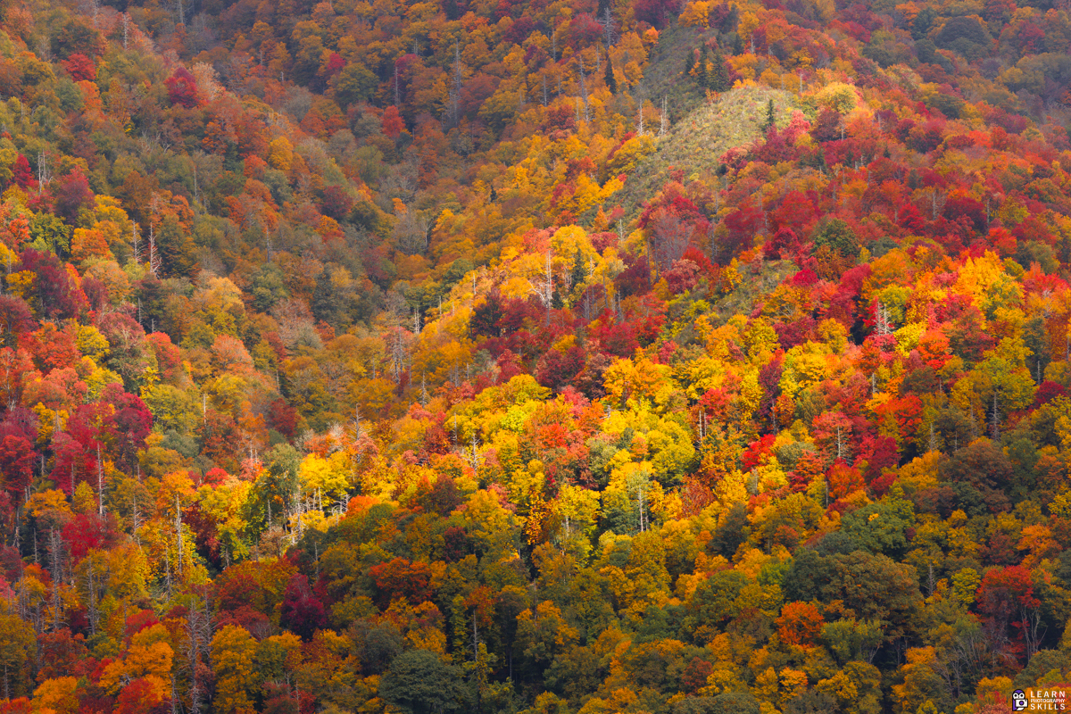
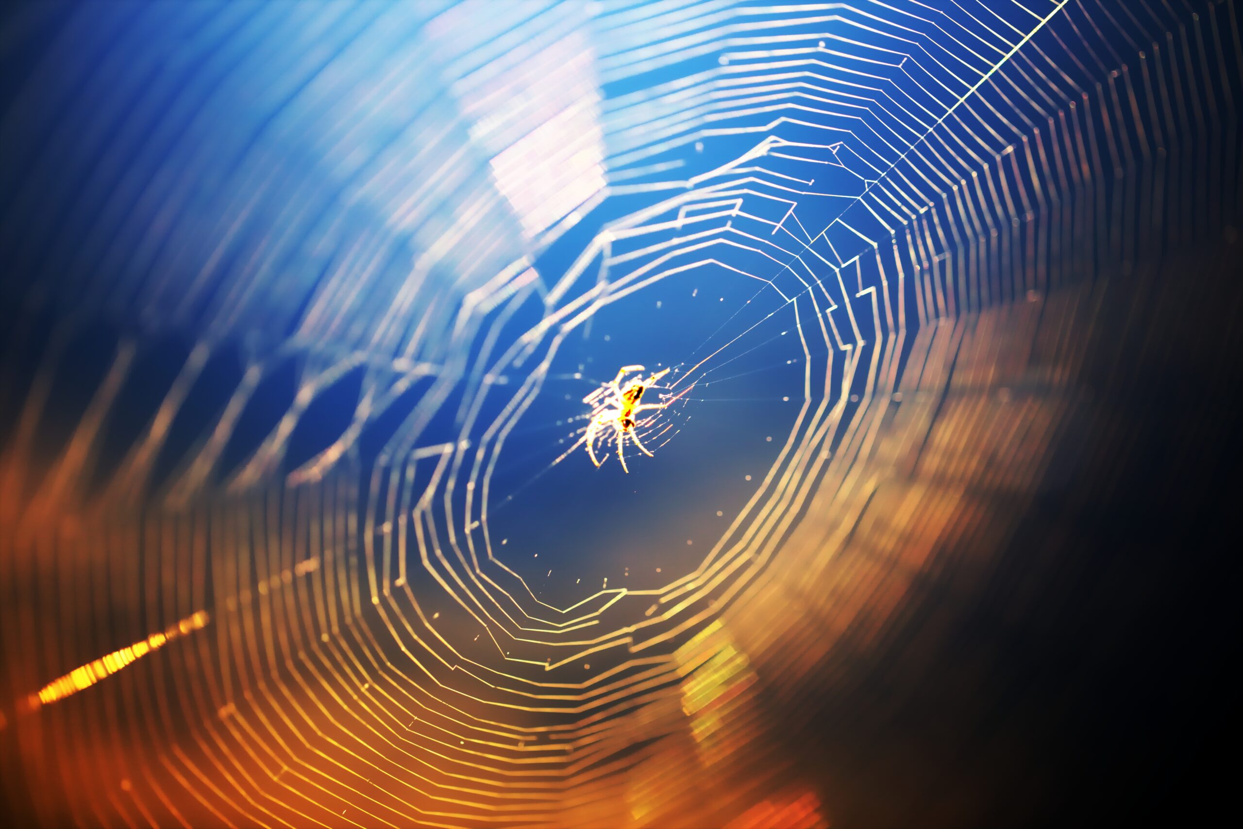
There are times during the fall when a boring old city park looks like the best place in the whole world. Maybe not every year, but every once in a while. I guess if it happened every day it wouldn’t be special, and you wouldn’t have to be a good photographer to get the shot.
I really like this one I got at the park about 20 minutes from where I live:
The key to good photography is sometimes being patient, and other times, it is making things happen. You can keep making stupid excuses, or you can get out there and start finding fall moments.
To sign up for the workshop just Click Here and you’ll get instant access to the course and bonus materials including a Fall Photography Cheat Sheet and an exclusive photo walkthrough of a few of my favorite fall photos from the Smokey Mountains.
Sunlight is the best light for photography because it is the only natural light available for us during the day time and at night we also have the moonlight to capture moonlit landscapes. Using natural light in photography can be the best way to make use of available light and it costs nothing. When there are unfavourable light conditions natural light can always be manipulated to our liking with a good understanding of how light works.
Here are some resources that will help you to use sunlight creatively in your photography.
Photo by Samson Katt
Lens flare is something that most lens manufacturers tend to minimise when manufacturing lenses, but it is also something that can give a cinematic and dreamy look to a shot or footage if used well. Usually when backlighting your subjects, it becomes almost impossible to eliminate lens flare if the sunlight is falling straight on the lens. So this article talks about how you can embrace lens flare and control it.
Photo by Omar Prestwich
Backlighting is a very beautiful way to illuminate your subjects because of the stunning rim light that can make your subject’s outline glow. Depending on how you backlight your subject, you may come across a bit of lens flare and this can be used creatively in your photography. This article provides five simple ways to use lens flare for creative photography.
You may have seen those stunning photos where the sunlight may look like starburst. Did you know that it is very easy to capture starbursts in your photo by just setting your camera’s aperture and/or moving around to position the sunlight in a certain way? This article discusses two easy ways to capture brilliant starbursts in your photographs. Here is another article if you wish to read more – How To Create A Starburst Effect In Photographs
Photo by Panoramas
We all know that most of the time, shooting into the sun, and exposing for the sun will give us silhouettes. Silhouettes are beautiful if shot well, but it is not always intentional. There are times when you want to shoot into the sun for dreamy images especially when shooting portraits. Instead of a silhouette, you will want to capture details in the photo and this article discusses that.
Photo by Ben Kelsey
Silhouettes are beautiful and dramatic if shot well. In order to capture silhouettes, you need to shoot into the light. To capture compelling silhouettes, you need to choose your subjects and the background wisely. This article discusses the secrets to capture effective silhouettes.
Photo by Kristian Saks
We have commonly heard about star trails in photography, but did you know that with some creative effort, you can also capture sun trails? Solargraphy is a long exposure technique where a pinhole camera is use to capture sun’s trails over a period of few weeks to months on black and white photographic paper. Check out this article for some sun trail images and an overview of the process.
Photo by Jason Row
When we think of capturing sunrises or sunsets, many photographers are geared towards capturing the sun in an open landscape, which can be exciting at first but can quickly become boring. If you look and compose these shots creatively, by paying attention to the elements in the scene and by carefully choosing the foreground and middle ground, these sunset and sunrise shots can be captured creatively and this article talks about just that.
Photo by Johannes Plenio
Sunlight hits differently during different times of the day and as photographers we need to be looking at how light illuminates the elements in front of us and capture it in creative ways. One of the most common subjects of photography is the sunset and rather capturing a boring snapshot, this article discusses five easy tips to improve your sunset shots.
Photo by Dawid Zawiła
Sunsets are magical and they most of the time lend a dreamy atmosphere in areas where the light falls. Sometimes even the light through a cloud opening can be very beautiful with a spot of light illuminating the area where it falls, leaving the other places look dramatic. This article will help you capture sunsets with an ethereal effect.
Welcome to our weekly community wrap-up. It’s been another great and exciting week on the Light Stalking forums with some great photography by the community. Members have been submitting high quality photos the past few weeks, which makes it even more exciting.
The weekend photography challenge from last week was “Light Of The Ordinary” and members had their creative take on the theme with very interesting shots – some of them are shared below.
This week, we have a new challenge that has some very beautiful submissions already. Join the challenge here – Everyday Stories
Here are some amazing shots from the past week that we thought were great and should be included here:
Backlit Flowery Bokeh – Copyright Robert Apple
Copyright Patrick
In a world of pixels and make believe – Copyright Patrick
Music in black and white! – Copyright David C
Dock Leaves – Copyright Tersha
Purple Haze – Copyright Robert Apple
Dandelion Seed – Copyright Tersha
Please, sir, I want some more … – Copyright Patrick
Light – Copyright Tersha
Copyright Michael
Copyright Holly K
Copyright Marty E
Copyright Marty E
Copyright Marty E
Copyright Rob Eyers
Copyright Patrick
Here are photos shared by members in other forums like General Photo Chit Chat, Landscape Photography, Macro Photography, etc.
Steve shared another powerful storytelling shot of a little girl full on athlete activity
Copyright Steve
Patrick is working on a series of abstract photos and has kindly shared the process on the thread here.
Copyright Patrick
And, Patrick has also started a new hobby. Head over here to check the photos!
Copyright Patrick
Rob captured a photo of crashing waves om his iPhone. The intent was to get a shot that shows scale Let him know what you think here.
Copyright Rob Wood
Discussions:
How do you improve? – Rob started a very interesting discussion on how photographers may fall into a few different groups. Join it here.
Steve started a discussion on Magnetic Filters. Join over here to participate.
If you are someone who captures images with your smartphone, we have a Mobile Photography Challenge where you can post your mobile photos and also check out the works by other photographers. The images must be captured and edited on a smartphone. Join to submit the photos over here.
Pat shared a stunning photo of the Aurora Borealis along with the Big Dipper to the mobile photography challenge, that was captured on her iPhone! Pat shared her experience when capturing this photo.
The sky was dark without any hint of what darkness was hiding. For the heck of it I grabbed my phone and took a shot of a black sky – a sky hiding beautiful shimmering colors.
Aurora Borealis along with the Big Dipper – Copyright Pat Garrett
There are also some members’ picks that are featured. These can be chosen by any of the members and are put in a whole new thread of their own and called out as being a great addition and shot for the forums. Check out those stunning captures here.
Patrick started a thread late last year – “Community Inspired Photo Story Challenge” – capture a story in 3 to 6 photos that hold personal significance and post them with a brief description. While that thread was started to be completed within a week, it has been open with ongoing submissions for the past year and is still open where members can post their stories.
Here are some throwdowns to follow and post your own photos, or you can start your own throwdown too.
Trees That Go Bump In The Night – Robert has started a throwdown and invited members to share their unusual photos of trees (Not Your Normal tree photos)
2025 Reflections Throwdown – a unique way to capture your own reflection, whether abstract or otherwise. There are many beautiful images to go through for some inspiration.
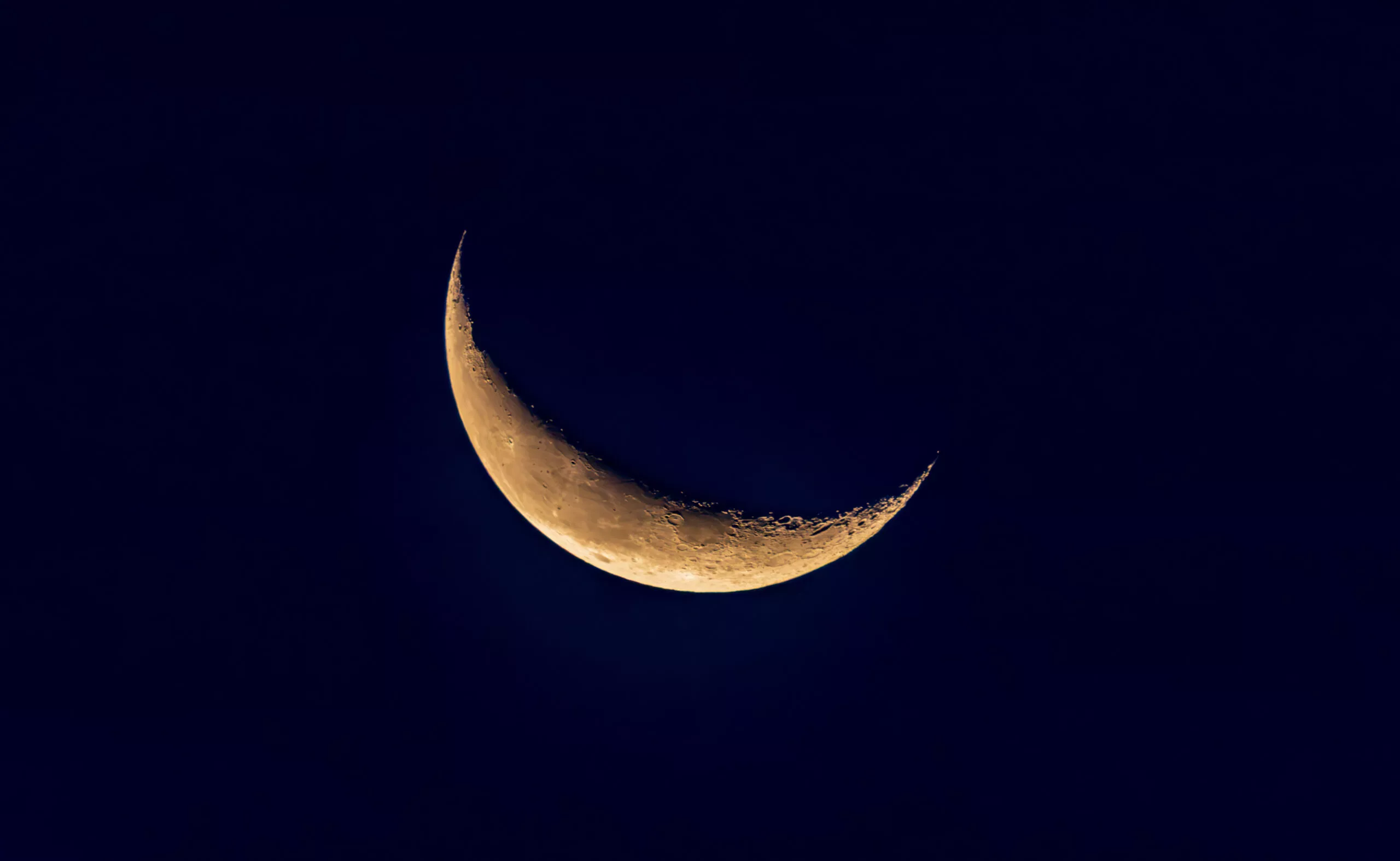
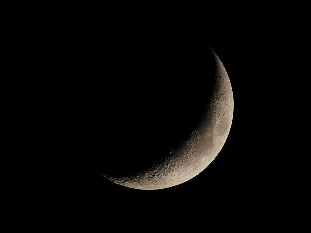
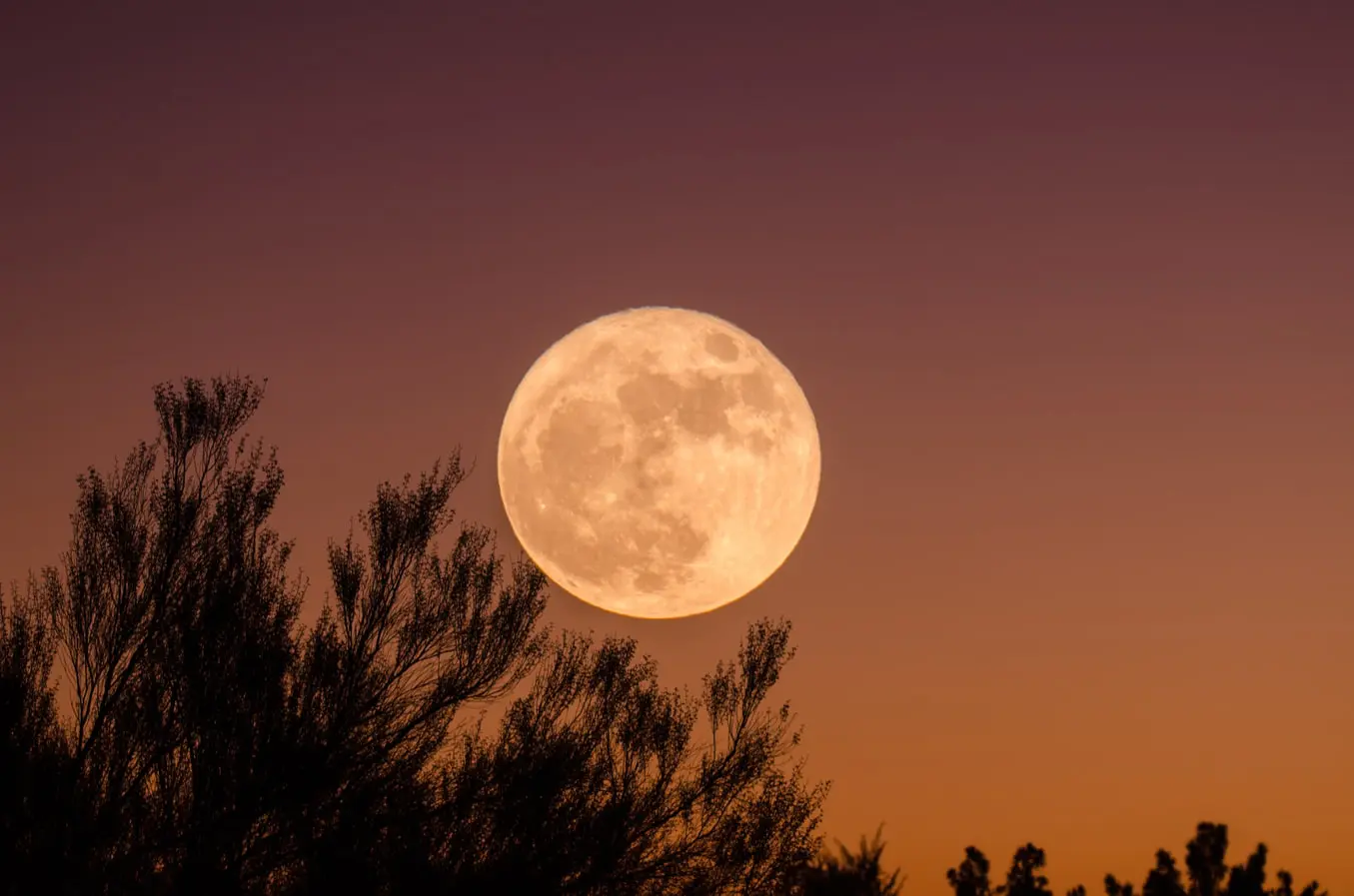
The night sky is stunning and the objects in the night sky are one of the most beautiful subjects that can be photographed mostly from your backyard. One of the most interesting and the brightest subjects in the night sky is the moon. Knowing the moon phases and a good understanding of controlling exposure in your camera can help you capture beautiful images of the moon.
In order to capture details on the moon’s surface, it is good to use a narrow aperture between f/8 and f/11. You will need a tripod, focus manually and use a shutter speed based on the focal length you are using to avoid motion blur. A remote trigger will also greatly help with capturing sharp images.
Grab your Milky Way Photography Blueprint for free righthere.
Here are some resources for effective moon photography tips and techniques.
Image by nousnou Iwasaki
When starting out with moon photography, most of us imagine those closeup shots of the moon that fill the frame, with a lot of details of the moon’s surface visible. When actually capturing the images, they may turn out to be a white blob or spot in the frame. This can be quite frustrating, but without giving up, check out this detailed guide on how to photograph the moon.
Image by Sebastian Voortman
If you are looking for some quick tips to refer to when photographing the moon, then this article quickly goes through a checklist that will help you to capture a quick shot of the moon. Always remember to make minor adjustments based on light, sky conditions and the gear that you use.
Image by Dahlia
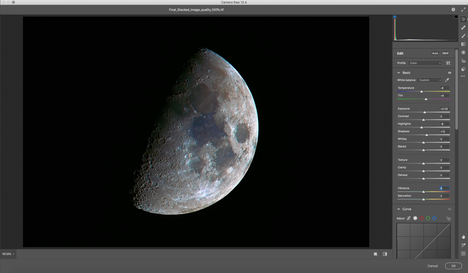
Did you know that the moon is not just white but has some interesting colours? This is due to the mineral deposits on its surface. If you have not seen the colours yourself, the next time you photograph the moon, switch to live view and zoom in on the surface of the moon. You will be able to see the colours on its surface without the help of any accessories – just make sure the sky is very clear. Now you can capture the moon and post process to bring out its colours. This article will take you through all the steps required to capture and edit a mineral moon.
Image by Dahlia – shot on iPhone 7 Plus
A lot of photographers these days start their photography journey with their smartphones and some continue to do so for a while. While a smartphone can be a great tool for most genre of photography, it can be quite tricky when it comes to capturing photos of night sky objects. With some patience and understanding of camera settings you can capture decent images of the moon. There are also telephoto lens attachments sold for smartphones that can be used to capture closeup photos of the moon. This article discusses all the essentials required to capture a photograph of the moon using an iPhone or an Android.
Image by Ganapathy Kumar
The rising or setting Moon glows in a bright orangish colour very similar to the rising or setting Sun. This is due to the fact that the light from the rising Moon needs to pass through the thick atmosphere, before you can see it. Most of the shorter wavelengths of light in the blue end of the spectrum are scattered while the longer wavelengths towards the red end are visible. During this time the moon can look a bit fuzzy without great details but with some care, stunning photos of the rising Moon can be captured. This article discusses 3 tips to capture a perfect moonrise.
Image by Ganapathy Kumar
Moonscapes may have a confusing meaning like a Lunar landscape or a devastated landscape, but here in this article, we are talking about a landscape or a cityscape photo, with the moon in the sky. The moon is such a beautiful subject that it can add meaning, story and mood to an otherwise boring landscape or cityscape. In this article, we have provided all the details you need to capture a stunning moonscape.
Image by Temudjin
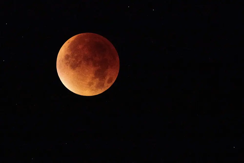
You may have heard of the term blood moon. During a total Lunar eclipse, the moon turns to a beautiful blood red because of the red light getting refracted and falling on the moon. A Lunar eclipse is quite a common occurrence compared to a Solar eclipse, but a total Lunar eclipse can also be a rare one, depending on where you live. So, if you wish to capture a photo of the eclipsed moon in the future, it is quite easy and this article will go through all the steps required to capture the blood moon.
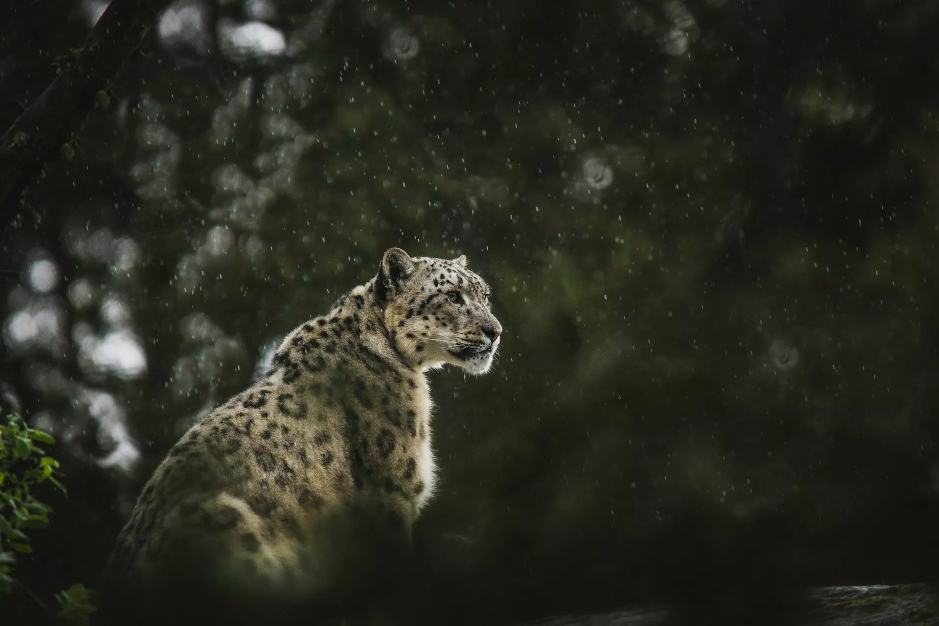
Wildlife photography is capturing photos of birds, animals and other critters in the wild, in their natural habitat. It is completely different from capturing photos of animals or birds in the zoo. Wildlife photography is not easy and requires a lot of patience and skills. It also needs educating oneself about different animal behaviours and having great respect towards wild animals.
Photographing wildlife will require special gear like a long lens and a camera that has continuous autofocus and can shoot in burst mode. In this article we have put together a set of tutorials that will help you to get started in wildlife photography.
Photo by Pieter van Noorden
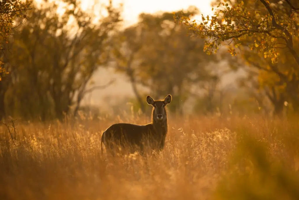
Wildlife photography is one of the most rewarding genre in photography and working with such stunning subjects requires a lot of observational skills, research and understanding of the subjects, to get the best shots. Scouting for locations, working with the light and elements and wisely choosing compositional techniques are some of the most important factors that will help to capture the best wildlife photos. In this article, we have put together some tips that will help you to capture beautiful wildlife photos.
Photo by Jeremy Hynes
Wildlife photography is quite different compared to other genre of photography in the sense you cannot always predict the behaviour of your subjects and it is also difficult to spot them in the wild. You may have heard of wildlife photographers who have spent days, weeks and months looking for their favourite or a particular subject. Besides you will need to take into account a few other factors as well in order to capture the best shots. If you are a beginner in wildlife photography, this article will help you get started.
Photo by Harsh Singh
In the early days into wildlife photography, you may be practicing with a smaller lens like your kit lens that came with your camera. Most of the time when this lens is used with a crop sensor camera, it will work well for shots of bigger animals that are not too far away and also for good environmental shots. Wildlife photography can be done better with the right gear if you are planning to take it up seriously and this article discusses the gear you need to get started.
Photo by Polina Koroleva
Some wildlife photos can be done better if you take care of some little things when out in the field. All animals portray attitudes and behaviour and capturing these against a good background can result in compelling photos. You just need to move around a bit and look at your subject from a different angle and perspective. This article provides some tips to add a wow factor to your wildlife photos.
Photo by Frida Lannerström
You may have started wildlife photography and shot a few photos but found that they are not very interesting. Following a few tips and techniques can help you capture better wildlife photos. This article talks about research, patience, backgrounds, light, settings for creative shots, composition, ethics and gear for wildlife photography in the form of short tips.
Photo by Alpha Perspective
If you are someone who lives in urban areas, you would have come across a few species off wildlife in public places. Photographing these wildlife is a way to get started in wildlife photography. Most of the urban wildlife are not very shy and come quite closer to humans compared to the animals and birds in the wild. Practicing wildlife photography in an urban area, is a great way to start wildlife photography. This article gives a few tips to shoot urban wildlife
Photo by Max Zaharenkov
There are times when photographers plan safaris or other wildlife expeditions and they will need to be in locations where they will need to work with the gear in hand for a few days or even more. Even if you go out for a day safari or wildlife adventure, you will need to pack the necessary gear in order to capture the shots without any stress. This article talks about the gear you need to pack when you go out for wildlife photography.
Photo by Debjoy Biswas
Once you have captured your wildlife shots, you will need to edit them to give the image a pop and the right colours. Remember to always shoot raw for effective post processing. A slight adjustment in exposure, contrast, adjusting the white balance, highlights and shadows will help to bring out the best from your raw files. Depending on the files, you may need to make further adjustments like vibrance, sharpness, clarity etc. This article talks about editing wildlife photos in Lightroom for visual impact.
I was 50 years old when I bought my first drone. It required me to learn a whole new set of skills not only in flying and navigating a UAV but also in learning new photographic and video techniques for my eye in the sky.
That was 2017 and last month I was 58 years old. But do you know what? I am still learning new things about photography. It would be cliched to say I learn something new each day, however I think it’s realistic to say I learn something new about photography every week.
There are two reasons for this. The first is that as photography is my primary source of income, it is important for me to keep ahead of new things. The second is the pace of change in photography – and indeed all technology – is phenomenal. It’s both exciting and scary.
Today we are going to delve a little deeper into this and look at why you are never too old to learn new things photography.
My first camera, as some of you will know, was a Zenit 11. It was bought for my 16th birthday way back in 1984. It had zero automation, manual exposure, manual focus, manual metering and of course shot film. My camera as of today is a Sony A7Rv, it’s automatic everything, packed with technology and of course shoots digital.
The change between that first camera and my current one has been exponential, so has my learning curve. Whilst the Zenit instilled in me an understanding of shutter speed, aperture, ASA and composition, the Sony has taught me things about AI focusing, the differences in video codecs plus a plethora of other high tech tools that I don’t necessarily need, but certainly would like to know about.
Beyond the actual taking of the image, the way we process those images has changed. My first film on the Zenit went off to Snappy Snaps and came back a week later as glossy 6×4 inch prints. My last “film” on my Sony was uploaded to my computer an hour after I got home, edited in Lightroom and on social media within two hours.
The fact that I could so comfortably upload, edit and publish my images comes from the steep but highly enjoyable learning curve that I undertook right from the very first days of shooting. The keyword is enjoyable.
For many of us, photography is not a profession, it’s a pastime. When you use your leisure time to do something, it can feel like somewhat of a chore to learn something new. However, the old phrase, practice makes perfect is not without merit.
The wonderful thing about photography, is that it doesn’t need hours poring over books or watching YouTube videos. All you need to do is get a gist of the new thing you wish to learn about, than simply go out and shoot. The beauty of digital cameras is that we can keep taking shots until we get it right, or until we have learned the technique we wanted.
Let’s return to my drone photography. When I first put the drone in the air, the last thing on my mind was taking photos. The main concern was how much this was going to cost me if I crashed. However, within a few flights I found myself enjoying the flying so much that it started to become second nature. So I started to take photos and videos. And you know what? They were awful.
I was at the beginning of a learning curve again. However, the fun factor not only of flying the drone but also of taking photos, drove me on to do better. Slowly, flight by flight, I came to understand the different approaches I would need to take whilst shooting from a drone as opposed to shooting at a fixed location.
My photography improved as did my desire to go out more often with the drone. Incidentally, the biggest mistake new drone photographers make is to take images from maximum altitude. The best shots come from down at mid and low levels. I created a video about that.
The point is that as we all enjoy photography, the learning part of it will come naturally. It doesn’t have to be forced, just go out, practice, practice and practice some more. The end results will keep driving you on to learn more.
Don’t Be Overwhelmed
As I mentioned, the pace of change in photography can seem like it is exponential. That in turn can make you feel overwhelmed at the sheer amount of new stuff you need to learn. Perhaps to a point where you just decide to stay with what you know.
You don’t have to be overwhelmed though. Whilst there are seemingly huge amounts of new techniques and technology that need to be absorbed, some, if not the majority of it may not be relevant to your photography.
If, for example, you don’t shoot video, any new video techniques, codecs or equipment is going to be irrelevant to you. If however, you are a portrait shooter and a new lighting technique becomes available, that may well be something you want to look deeper into. It’s all about learning the things that will make you a better photographer.
There is another thing to bear in mind, particularly in this short video, TikTok world we live in. That is, viral photographic trends are often just that, trends. They very rarely lead to improved technique or long term betterment of your photography. They are effectively cheap tricks to garner views. Cut this fluff out of your photographic learning process and just concentrate on the information that will improve your creativity.
For the bulk of this article I have come at it from the point of an older person. However, I also think many of the things mentioned are as important if not more important to younger photographers. If you are starting your photographic journey today, it is perhaps more vital to try and stay ahead of that ever increasing curve. In the near future, we will have cameras that allow you to change focus and depth of field in editing – we already do with smartphones.
We have the ever increasing encroachment of AI images and with it the moral considerations of using it. The rate of technological change will only increase and with it our potential to be inundated with information that may not be relevant to us.
I would suggest that it’s more important than ever for a younger photographer to experiment with genres, but also to concentrate on one or two they enjoy the most.
Photography is and always will be a lifelong learning curve. Back in the days when I started, it was pretty simple – learn exposure, learn focus and concentrate on composition.
Today, the way we shoot has changed massively and to remain relevant we need to concentrate on learning the things that are most important to our photography. If you can sort the chaff from the wheat, you will find yourself continuing to learn and enjoy your photography.
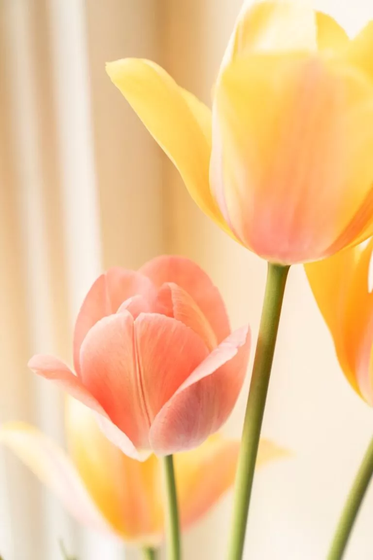
Flowers are colourful and come in all shapes, sizes, textures and colours. They are also used to celebrate important moments in life and as a daily addition to brighten up spaces. If you are a beginner in photography, flowers are great subjects to start with. Whether you have a camera or just your phone, you can use it to capture beautiful photographs of flowers.
If you are someone who prints photos to hang in your space, flower photos truly work as great printed pieces and can add a pop of colour to your space. A basic camera and your kit lens or a 50mm lens or even your smartphone, are all you need to get started with flower photography. You can also capture interesting macros of flowers that can be both abstract and intriguing. In this article,, we have put together a set of tutorials that will help you to master the art of flower photography.
Photo by Zoe Richardson
When photographing flowers, people may not consider it as a very serious subject and approach it without much thought or any other creative techniques in mind. For example for closeup details of textures on the flower you will need to use a narrow aperture and get quite close to the subject and for a photo where you want the flower to stand out from the background you will need to shoot using a wide aperture. This article provides a detailed guide on how to photograph flowers for great results.
Photo by Stux
We cannot imagine a world without flowers, can we? Flowers add a lot of beauty colour and magic to landscapes and gardens. Flowers come in all shapes, colours and sizes and they can be photographed in different ways If you take a little care in terms of light, composition and techniques, and you can create stunning results. This article discusses 8 tips that you should embrace to get the best out of your flower photography.
We would all imagine that flower photos can only be captured with a wide or moderate focal length lens, but there are times when flowers may be high up on a tree or in a location where you may not be able to get close to the flower/s. Besides, using a telephoto lens for flower photography will also help with achieving various looks and effects in the resulting images. this article discusses how to capture great flower photos using a telephoto lens.
Photo by Cristiane Teston
Flowers are attractive and they most of the time attract birds and other critters with their vibrant colours. There is a lot of science behind why certain flowers are evolved to be in terms of their colour size, form and shape. When the colour is removed you can look deeper into the textures and other details of a flower. Here is a collection of black and white flower images with a small write up of what the author feels about black and white flower photography.
Photo by Erik Karits
Have you looked at flowers up close? Observed their intricate details? There are a lot of beautiful textures, and even some forms that can be observed, which can go unnoticed otherwise. Macro photography of flowers is something that will help you to capture these stunning details. If you take care of the lighting, composition and a few other factors, you will have beautiful resulting images and this article discusses those details.
Photo by Rapha Wilde
One of the best subjects for macro photography is flowers. Macro photos of flowers can be captured when in the fields but there are times when the weather may not be favourable, especially if it is windy and in those situations, the flower can be brought indoors to capture its minute details. Unless you have good window light that can illuminate your subject, you may need to use some kind of artificial lighting setup to capture sharp details. This article discusses how to set up a lighting studio to capture macro photos of flowers.
Photo by Danielle Stein
Flowers are brightly coloured and they bring in a lot of cheer to the place they are in. Some flowers are very brightly coloured and they just bring a pop and mood to a spot or surroundings. When capturing or editing flower photos one does not always need to stick to the bright and cheerful style but can also lean towards the dark and moody vibe which works great for flower photography. When capturing images for this style, and during the editing process, some care needs to be taken, which may be slightly different. This article talks about capturing and editing dark and moody flowers or in general flora.
Photo by Charles Smart
Most of the time, we may be photographing flowers in our own garden. When doing so we have a number of opportunities to capture the flowers differently. The tools we use in the garden and other garden features can serve as interesting backdrops or props and this will help to capture interesting storytelling images. This article was written after taking inspiration from my small garden and explains how to capture photos in your own garden for stunning results.
Photo by Sheen
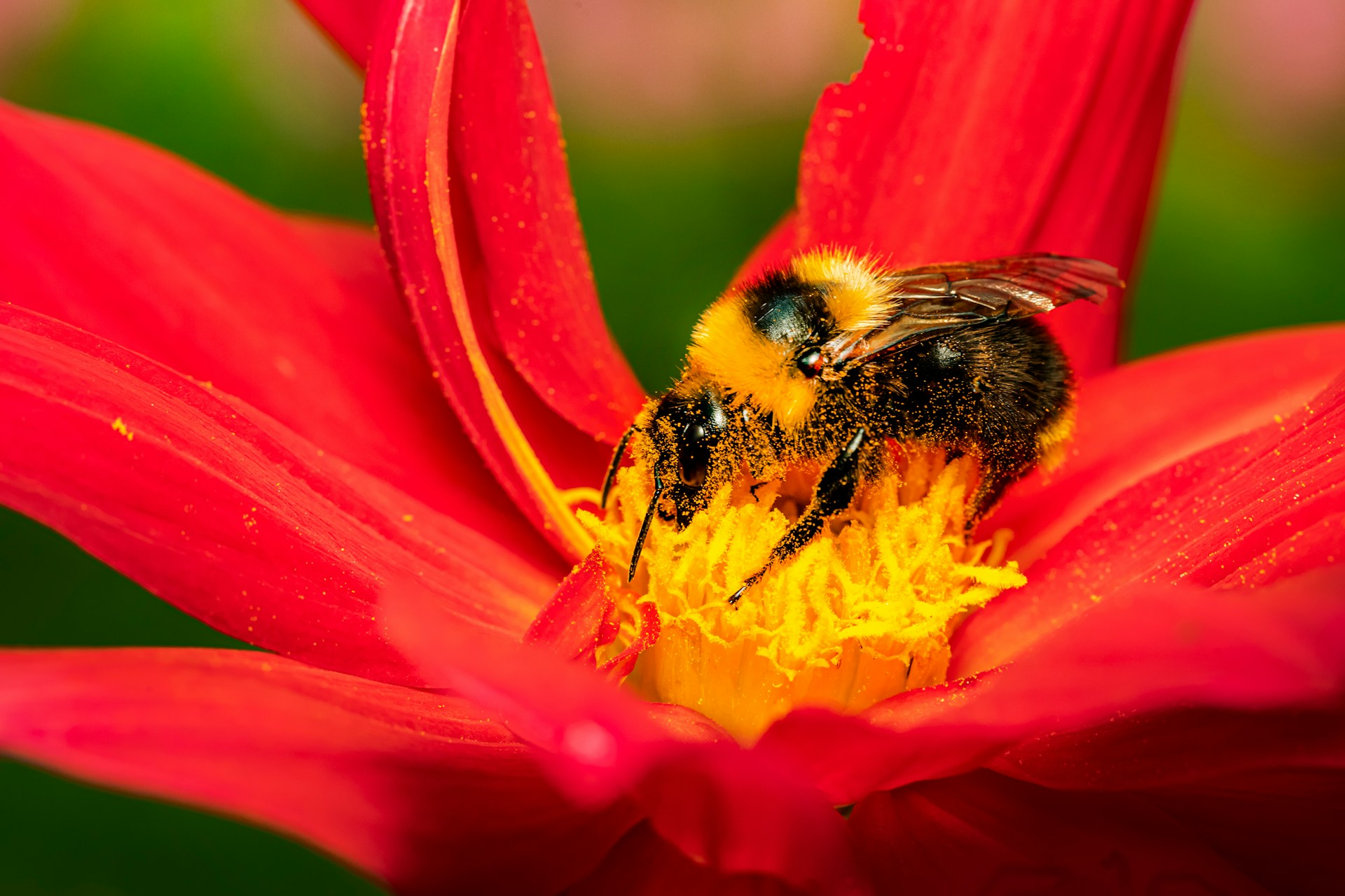
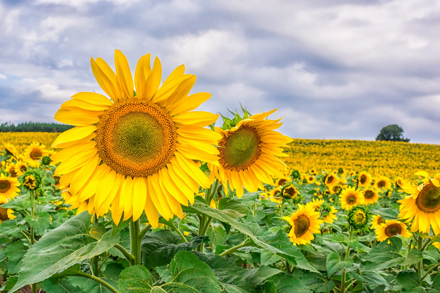
There are many types of flowers on this planet – some big, some small and others very tiny.. There are times when you may come across a field of a particular flower and you may be running out of ideas to photograph in that location. It may look too busy or you may be confused but the right choice of focal length, and composition can help you capture beautiful shots. This article discusses how you can photograph the gorgeous looking sunflowers in different ways. This can also be applied to other flowers.
Photo by Sheen
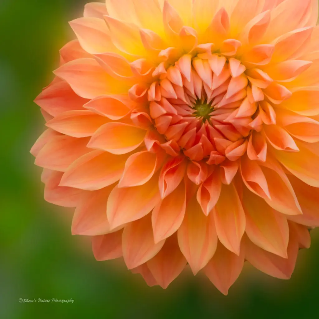
Here is another article that talks about capturing a particular flower – Dahlias. Dahlias come in a variety of colours, shapes and sizes too and choosing the right combination of colours will work great. If you love dahlias and are interested in capturing their beauty, then this article talks about the different ways these flowers can be photographed, creative post processing including black and white, lens choices and more.
We are all used to wireless Internet. It’s been around in one form or another for 25 years and pretty much every connected household will have a Wi-Fi capable router. However, many of us might not realize that modern cameras also have a number of wireless capabilities that can enhance our workflow or allow us to capture unique images.
Today we are going to cut the cord and take a look at some of the many ways that we can utilize wireless connections in our photography.
There are actually a number of ways for creating a wireless connection in your camera. This will obviously depend on the camera specification but these are the most common ways.
WiFi – In this mode you connect your camera to your local Wifi network. You will need to search for your network then enter your WiFi password. For security reasons it’s best limited to a home, well secured, WiFi network and not open source free WiFi. However if you are looking to have WiFi connections in the field you can buy portable hubs. These are often used to connect multiple devices to 4/5G data whilst traveling.
Bluetooth – Many cameras now come with a version of Bluetooth for short range wireless connectivity. As Bluetooth has evolved it has gained more and more capabilities, making it increasingly useful in cameras.
On camera adapters – These adapters are most commonly attached to the hot shoe and connected to a camera port via a shot cable. They allow for the wireless connection of more complex peripherals.
Those are the primary wireless connections that our camera may be able to make. But what can we do with them? Let’s find out,
Bluetooth Wireless to OEM Smartphone App
The most common wireless connection we will make with our cameras is to connect to the manufacturer’s dedicated app on a smartphone. Mainly connected through Bluetooth, these apps have varying degrees of capability and usability.
Some of the functions might include –
Remote viewing and shutter triggering.
The ability to change camera settings remotely – usually this is limited to exposure controls and sometimes focus points.
GPS locations gathering – many cameras do not yet have GPS built in, but some apps can geolocate the camera’s position using the smartphone’s internal GPS.
Image transfer to a device – apps can often wirelessly transfer images from the camera to a smartphone, tablet or computer over Bluetooth. Whilst useful in the field, it can be a slow and sometimes unreliable process.
Send images to the cloud – usually the OEM’s own cloud server but sometimes sites such as Dropbox or Google Drive
Manufacturer apps can be a useful way to wirelessly connect your camera. However as they are provided free, often they can be a little clunky, limited or even unreliable. For some cameras there may be third party, paid apps that do a better job.
Bluetooth to External Accessories
The increasing capability of Bluetooth has led to the ability for cameras to connect wirelessly to peripherals. The most obvious example of this is connecting the camera to a gimbal via Bluetooth.
With gimbals, you are able to control the camera directly from an interface on the gimbal itself. Controls might include, triggering the shutter/record button, focussing the camera and even controlling some aspects of the exposure.
Other uses include connecting hotshoe mounted wireless adapters to a smartphone. Typically this might be a wireless flash trigger that can be controlled from your phone.
Many printers these days are wireless and can easily connect to a camera directly. You can send images straight from your camera to the printer, without the need to import them to a laptop.
As Bluetooth is a relatively low powered wireless connection, any peripherals will need to be in close proximity to the camera.
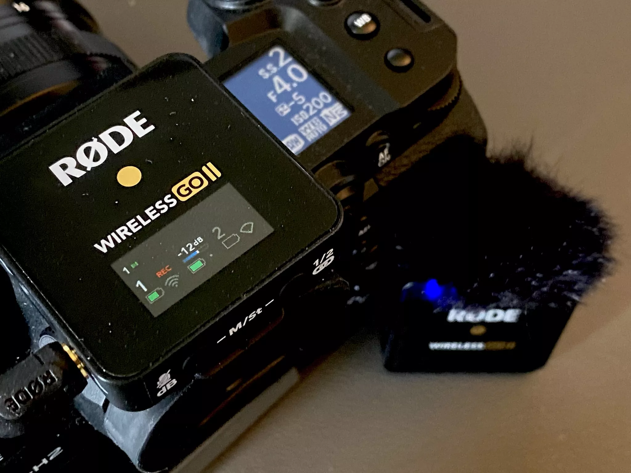
The Wirelss Go II system is a good example of cutting the cord. By Jason Row Photography
Wireless Tethering
Tethering is the ability to connect our camera directly to our computer, either a desktop or laptop. In wired form it has been around since the early days of digital cameras. However in recent years, it has become increasingly wireless. Mainly this is done over Wifi as it has a better range.
Why would we need to tether our cameras? The most common use is in a studio environment. A photographer can be shooting whilst the camera is simultaneously downloading the image to an editor. This can greatly speed up the workflow in busy studios.
Tethering can also allow the photography to see the live image on a large, color calibrated screen. This allows them to make minute adjustments to exposure, color and even focus.
Recent developments in wireless tethering have allowed our stills cameras to be adapted as high quality webcams. With the advent of video conferencing, especially during the pandemic, this has allowed for much higher video quality in calls.
Wireless Adapters
Some more complex wireless photographic systems require specialist adaptors that attach either to the camera’s hot shoe or baseplate. The most common applications for these are in remote photography and flash triggers.
The simplest form of remote photography will be a wireless shutter/intervalometer. This will allow the photographer to remotely control and trigger the camera from a short distance away. These types of remotes are often used in long exposure and time-lapse photography. There are also often much cheaper third party options available for OEM models .
A more complex type of remote trigger system involves motion detection to trigger the camera. These are often used in camera traps for wildlife photography and research but also, increasingly in sports photography.
The other main use is to trigger complex flash set ups. A wireless adapter is connected to the hot shoe where it talks to the camera flash dedication module. This adapter is wirelessly connected to multiple flash units and even smartphone apps. The system allows the photographer to minutely control the power output of each flash unit to finely tailor the lighting on the subject.
Another form of wireless adapter is one that connects to the camera baseplate. These are often OEM models that allow for ultra fast transfer of images to remote computers. Typically these are used in sports photography where images need to be online within seconds of being taken.
These are just some of the very powerful ways we can wirelessly control our cameras. From simple image transfer to capturing endangered species without encroaching on their habitat, wireless photography has become a powerful tool – one that is almost universally available.
Do you use wireless for your photography? Feel free to share your experiences in the comments section below. We would love to know!
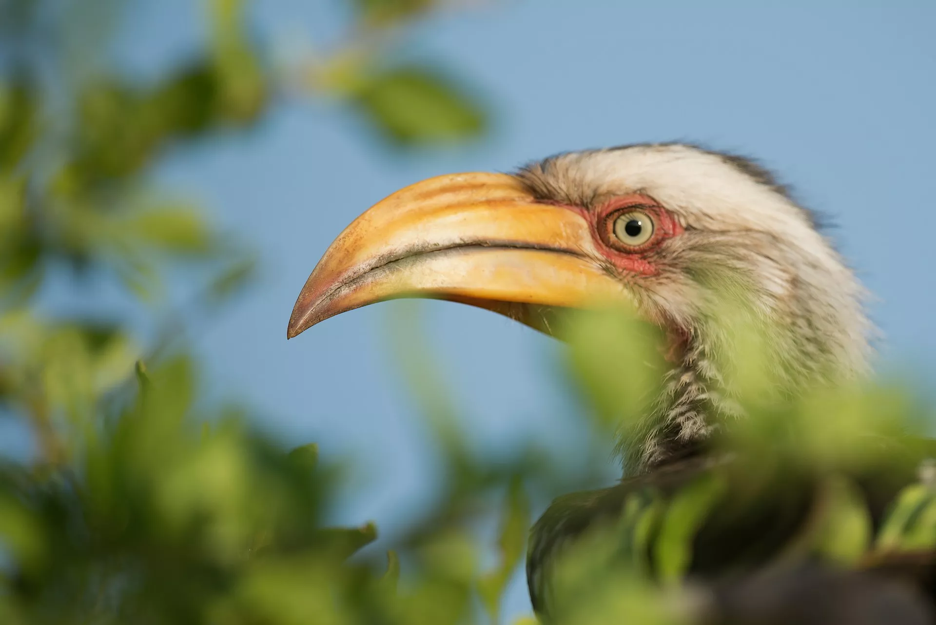
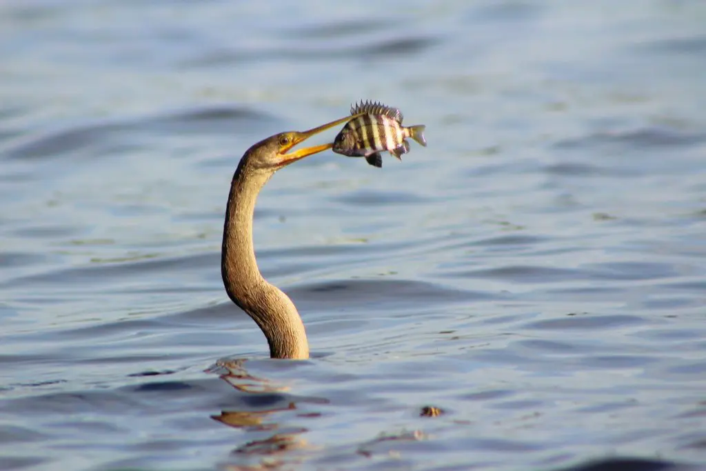
When it comes to wildlife photography, birds, especially the smaller ones are the most difficult to photograph. In general, birds are the most difficult subjects as they are small, stay in between the foliage most of the time and are always moving or flying around. Bird photographers make it look easy and a lot of YouTube videos (not all) also make it look quite easy but practically being in the field, carrying a heavy lens, focusing through the natural obstacles and capturing the right moment, can all be quite a daunting experience.
Photo by Vincent van Zalinge
Besides the photography techniques part, learning about birds themselves can be very helpful in terms of photographing them at the right moment. Observe and study their behaviour and be very discreet when photographing them.
Wearing the right coloured clothing is also important for bird photography and wildlife in general. Most importantly, be patient and persistent – do not give up if you do not get good shots during your early days in bird photography.
In terms of camera settings, the one that has worked for me personally is, shooting in Aperture Priority mode using back button focusing technique and always shoot raw. Here are some valuable bird photography tutorials, that will help you get in the right direction.
Photo by Ingo Doerrie
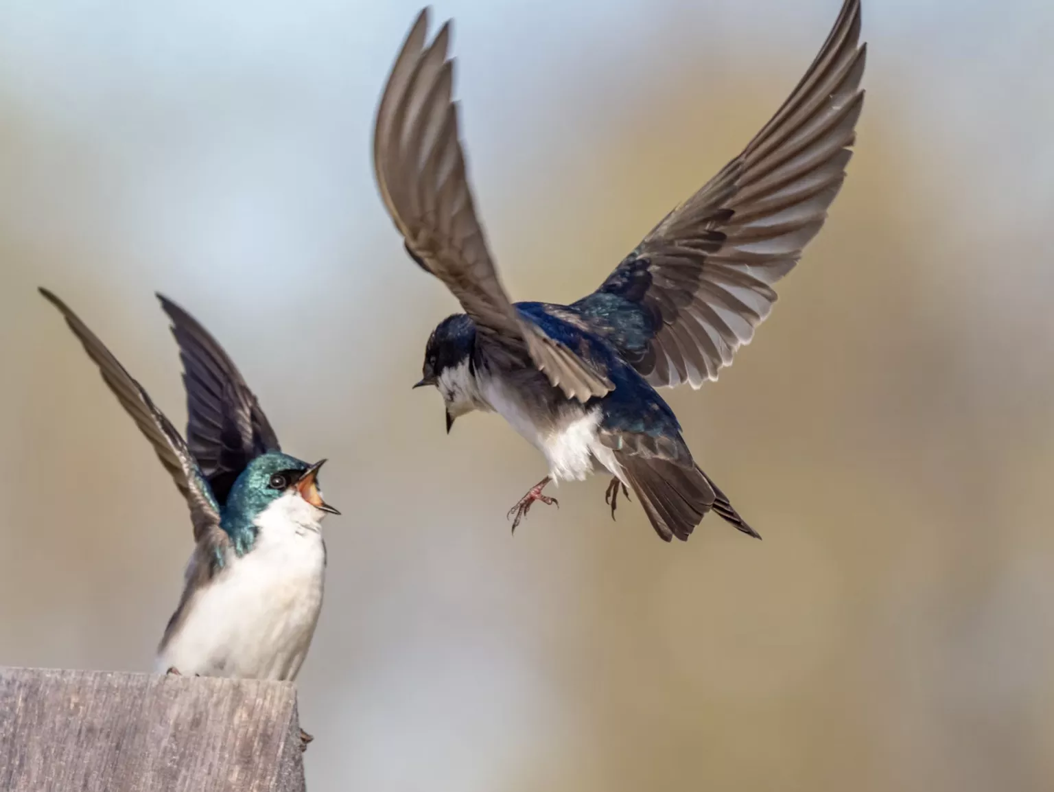
When photographing birds, the images are more compelling and effective, if you capture their natural behaviour in the wild. Birds portray some very interesting behaviour and traits that if observed patiently, can be photographed as well. This article talks about bird photography basics followed by actions you can do in the field to create better photographic opportunities and a few tips on honing your skills.
Photo by Patrice Bouchard
Mastering bird photography is a long process that has a lot of factors that need taken care of. They are some of the most difficult and trickiest subjects to photograph and once you get the basics right, making use of the right settings is important for successful bird photography. This article discusses the best settings for bird photography.
Photo by Zdeněk Macháček
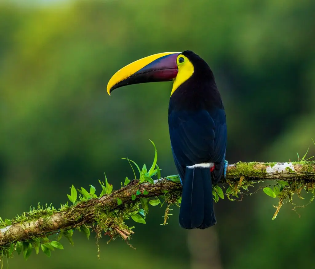
Birds can be photographed in many ways – capturing their actions, capturing their portraits up close or capturing an environmental shot that includes the environment they are living in, birds in flight, etc. Action photography can be quite difficult when compared to portraits, but again it depends on the type of bird and its behaviour. This article talks about two types of bird photographs that will help to improve your skills.
Photo by Jay Alexander
Wildlife photographs can boost any photographer’s portfolio because it is a genre admired the most by many photographers and non-photographers alike. In order to capture wildlife at its best, the photographer needs to have reasonable gear to start with. This article talks about the gear you need to pack when you go out for wildlife photography.
Photo by R. Mac Wheeler
Wildlife photography includes photographing birds, animals and other small critters in the wild. While bird photography may require slightly more skills with focusing and longer lenses, the techniques required are quite similar. This article discusses some quick beginner tips that will help you capture some stunning wildlife photographs.
Photo by Boris Smokrovic
Wildlife photography is not something that is commonly taken up by most photographers because they think that capturing wildlife is very difficult and that it needs very expensive gear. You can start off with the lens that you have in hand and then invest in a slightly bigger lens when you are confident enough in photographing wildlife. This article provides four tips that include emotion & attitude, nature’s frames & backdrops, unique features and taking advantage of the weather.
Photo by Rob Potter
Once you have come back from a bird photography session, you will need to check your images and make some edits before you can present them or even print them. Lightroom is a versatile tool that helps with culling images and also processing images easily and if you have a personal preset that you like to use for your wildlife photos, then that can cut down a lot of editing time. This article talks about editing your wildlife photos in Lightroom for magical impact.
It feels like the last couple of years the words artificial intelligence have dominated the photographic world. Camera companies, editing tools and stock agencies have rushed to embrace the AI revolution, often with a seemingly blatant disregard for the views of real world photographers.
However, whether we photographers love or loathe the rise of AI, there is no going back. That horse has bolted and we now have found ourselves in a position of how, when and why to embrace AI in our photography.
Not all AI is a force for bad in the photographic industry so today we are going to look at the good, the bad and the ugly. In order to end this article on a more positive note, I will start with the ugly.
The Ugly Aspects Of AI In Photography.
The obvious choice would be AI imaging, however I am going to put that into the bad, not the ugly. The real and most potentially damaging aspect of AI imaging is misrepresentation.
This can range from relatively harmless social media engagement farming all the way to the manipulation of politics using deep fakes. The latter can be blatantly obvious or it can be very subtle. An example of subtle manipulation is the use of deep faked old images of a country suggesting how things were so much better back in those days.
On Facebook the use of AI imagery to farm social media engagement has become rampant. Typical examples will be very obviously fake AI images of, for example, London in the snow. The images look beautiful to someone that knows little about London but to anyone who has ever been there, or to any photographer, they are blatantly AI. However there are huge numbers of people that believe these images and like, comment and then follow these pages.
Images like this are used to “farm”massive engagement on social media
All very innocent you might think, after all following a page of pretty pictures, is not harmful. However, the intent of these pages is often not that simple. Behind them are often companies or political groups that once they have enough followers, will change the name and tone of the page to suit their needs.
There are also deeper problems with the use of AI within the photographic community.
First and foremost is the homogenization of images. With stock agencies now licensing AI work, we are in danger of a world where websites and adverts are full of vaguely similar, faintly realistic images that actually have no relevance to real life. Of course the driving factor for this is cost, but by keeping the spending low, designers and advertisers risk losing the creativity that the photographic world brings to them.
An AI landscape that literally took second to create.
The Bad
I put AI imaging in general in the bad category. For this I am talking more about the use of AI within the general photographic community and industry rather than its worldwide use.
Whilst the use of AI images in social media and political campaigns is ugly, the general use of AI in photography I feel is bad but not surprising. The worst aspect of this is photographers, or indeed even non photographers passing off AI images as real photographs. Landscapes and wildlife seem to be particular favorites as they can appear a little more authentic than images of cities and towns.
Another concern is the potential loss of skill sets. Whilst enthusiast photography will continue, the demand for commercial, professional photography is at risk and with it the skills, talent and creativity of a large number of professional photographers.
There is also the issue of the use of AI within real imaging. Personally I differentiate between the use of AI to add elements that didn’t exist and the use of AI to aid editing. The former is bad, the latter is ok.
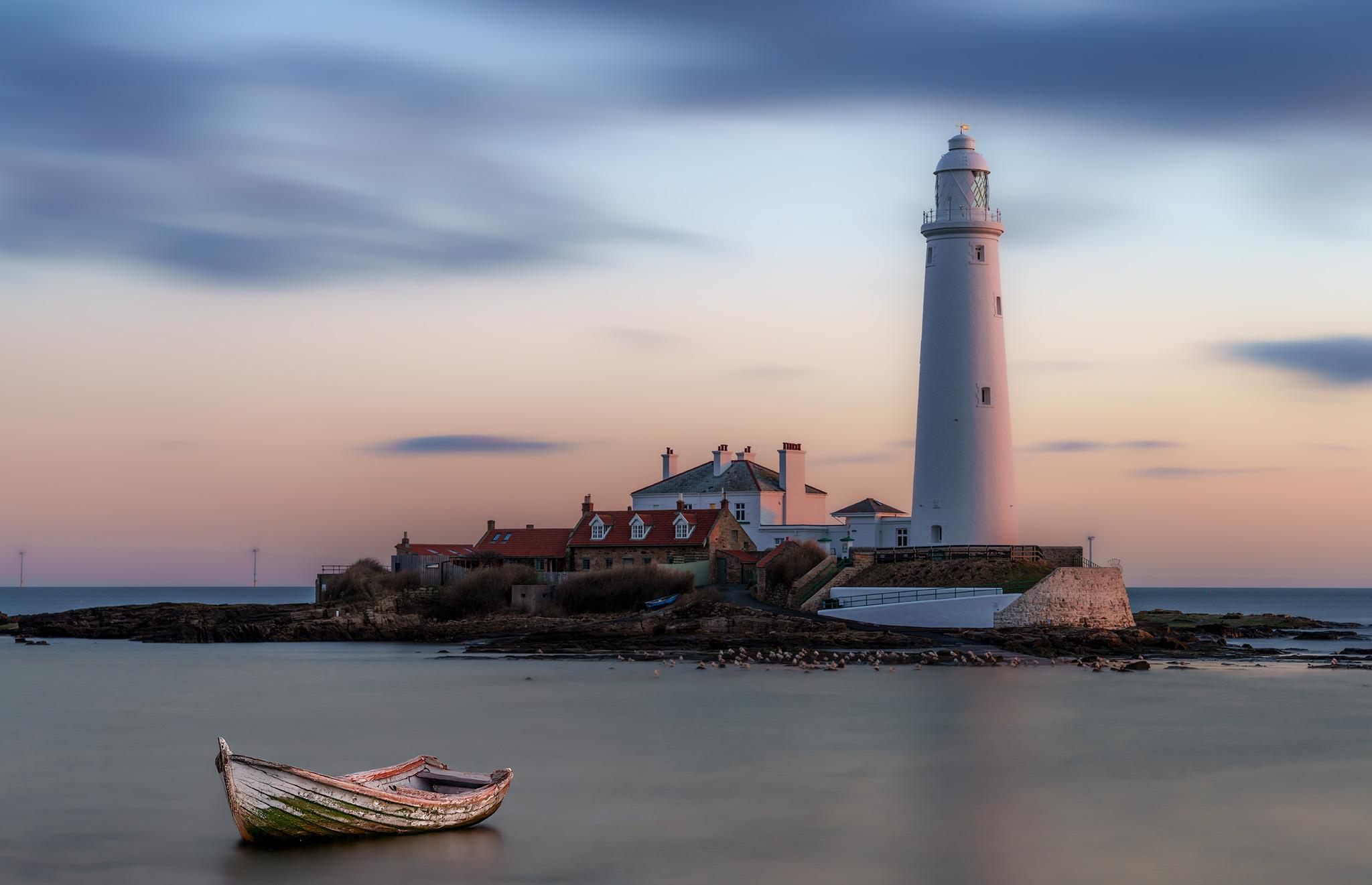
However, increasingly, some photographers are using AI to add elements to real photos that did not actually exist. One of the more obvious is the addition of light beams to twilight shots of lighthouses. However there are plenty more examples. Whilst I am not against this, I do feel photographers should be upfront about the use of AI to add to a shot.
There are also very real issues around copyright within AI imaging. Most non-photographers believe that an AI generated image is created entirely inside the CPUs of a vast computer. However, that’s not the case. AI has to be trained, and the only way it can be trained is by looking at real photographs by real photographers.
A significant number of the main AI companies have trawled the Internet, harvesting images without permission or recompense, throwing up also sorts of legal complications. It’s quite possible that you might see an AI image that looks startlingly similar to one of your own and not have any control over how it is used.
An AI stock image trained on real images, often without permission.
There Is Some Good News.
As I mentioned earlier, AI is here to stay. As photographers we can choose to ignore it (at our peril) or we can choose to embrace the more positive aspects of it.
At its simplest, we can use something like ChatGPT to inspire us when we are in the photographic doldrums. Simply tell AI what types of photography you like doing, and ask it to give you suggestions. This can be for a simple one hour shoot or for a year long project.
AI chat can also give us good answers to technical and even creative questions that we have about photography. Because photography is such a well trodden path online, the answers are often surprisingly comprehensive and accurate.
We will increasingly see the use of AI built into our cameras. My Sony a7Rv for example uses AI for focusing. It can determine the difference between multiple different subject types and predict their movement. AI will be incorporated into metering, white balance and quite possibly in the future, as a compositional aid.
Ai Chat can help solve problems and even inspire you
AI is increasingly being used in editing software. One of the most powerful tools I use is Lightroom’s AI denoise. I can now take 61mp images at 12800 ISO, run them through the denoise and get almost perfect, noiseless photos.
AI removal tools take a lot of the legwork out of cloning out blemishes or unwanted elements. We can automate tasks more easily, especially useful for photographers having to work on large batches of images. Selection tools have also become much easier to use with the advent of AI.
The use of AI in photography is a tricky and controversial subject. However, it is not going away and will only increase over time. As photographers it is our duty to define the way AI evolves, to be part of it rather than a victim to it. That is very much the challenge ahead for all of us.