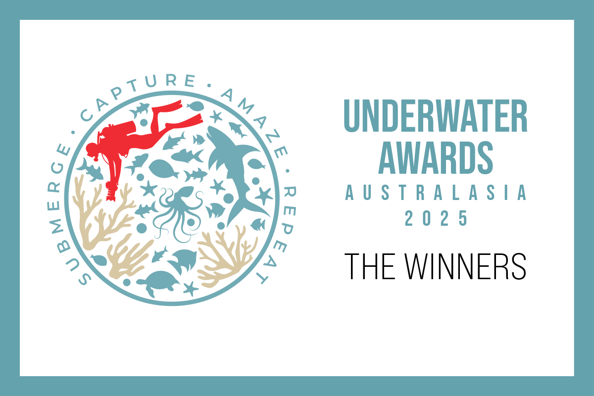
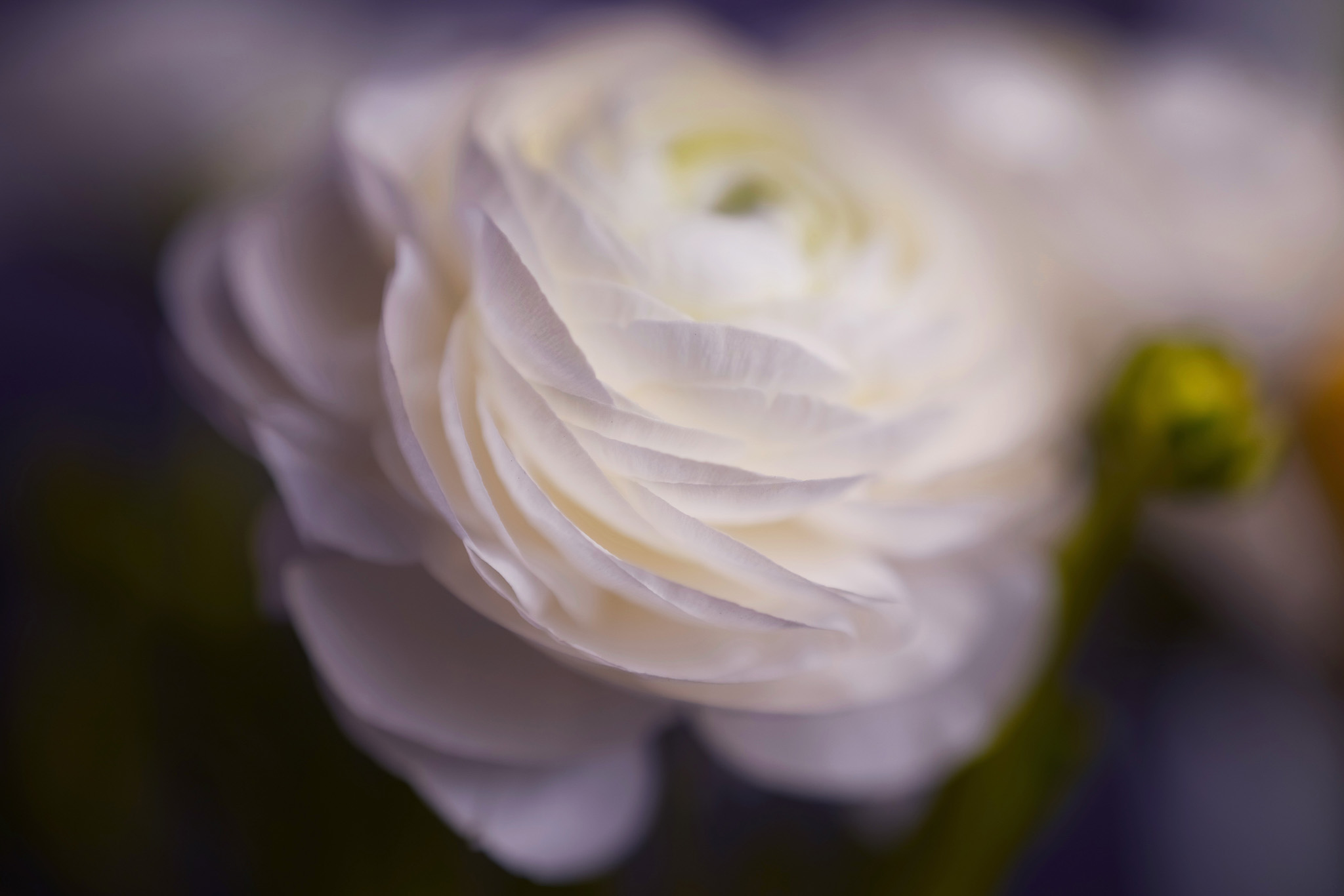
The organizers of the Underwater Awards Australasia 2025—DPG, Underwater Australasia, and UW Images—are proud to announce the winners of the 2nd edition of the underwater imaging competition focused on the Australasian region. The winning entries were revealed on stage today, September 6th, 2025, at Go Diving Show ANZ in Sydney, Australia.
The competition called for passionate underwater shooters from around the world to submit their most captivating and compelling images and videos from the Australasian region. Shooters were invited to immerse themselves in the challenge of capturing the essence of this extraordinary realm, where every frame tells a story of the delicate balance and breathtaking beauty that characterises our oceans.
Entrants competed in nine categories for prizes worth more than A$70,000 in total, including dive trips with the world’s top resorts and liveaboards, as well as the latest underwater photo and video gear. The prestigious judging panel comprised photo judges Tobias Friedrich, Jayne Jenkins, Matty Smith, Tanya Houppermans, Scott Portelli and William Tan; and video judges Philip Hamilton and Ross Long.
The overall winner of the competition—the “Best of Show”—is James Ferrara, whose striking shot of an open-mouthed leopard seal takes the top spot in the International Waters category. The other category winners are Vadim Belakhov (Sharks), Neil Vincent (Conservation), Talia Greis (Sydney), Marcia Riederer (Australian), Jake Wilton (Portfolio), Luciano Morales Corinaldesi (Smartphone/Action Cam), Imogen Manins (Tough TG), and Laura Gourgas (Reels Showcase).
The organizers would like to extend their congratulations to all the winners, runners-up and honorable mentions, as well as their thanks to everyone that entered the competition. The organizers would also like to express their immense gratitude to the contest’s esteemed judges and generous sponsors, without whom the competition would not have been possible. The exhibited metal prints of the winners and runners-up are available for purchase at the show, with the generous permission of the photographers. Half of the proceeds will be donated to the competition’s environmental partners Australian Marine Conservation Society and Take 3 for the Sea.
Discover the winning entries below or check out UnderwaterCompetition.com.
Underwater Awards Australasia 2025

Best of Show: International Waters – Gold – “Wide Open” by James Ferrara (USA)
Shooting Location: Antarctica
Equipment and Settings: Sony a7R Mark V, Nauticam housing, 2x ONEUW ONE 160X Mark II strobes (f/5.6, 1/250s, ISO 800)
Photographer’s Comment: “When it comes to photographic subjects in Antarctica, the leopard seal sits at the top of my list. Known for their mix of curiosity and aggression, they’re a dream subject for any underwater photographer. While these powerful predators often rest on ice floes to conserve energy after a big meal, I was fortunate enough to spend time in the water with this one. At first, it was standoffish, keeping its distance, but as the encounter progressed, it became increasingly curious. By the end, it was opening its mouth and flashing its teeth—a clear display of dominance, a reminder of who’s in charge! Though I felt a jolt of nerves, the thrill of experiencing my dream scenario kept me focused, present, and absolutely in awe.”

International Waters – Silver – “Japanese Jellyfish” by Luc Rooman (Belgium)
Shooting Location: Lake Veerse, Holland
Equipment and Settings: Nikon Z7II, Isotta housing, Backscatter Mini Flash 1 (MF-1) strobe (f/16, 1/125s, ISO 100)
Photographer’s Comment: “Every year during the summer months of June, July, and August, there is a veritable explosion of Japanese jellyfish. These creatures are very small, about 3 to 4 centimeters, and beautifully colored, but not as harmless as they look—their stinging cells cause severe burns. Swimmers beware! But for underwater photographers, they are so wonderful to capture. Here, I left the backscatter in the image so that the jelly looks like a UFO in a starry sky.”

International Waters – Bronze – “Emerald Sanctuary” by Maryline Renault (Singapore)
Shooting Location: Tulamben, Bali, Indonesia
Equipment and Settings: Sony a7R Mark V, Nauticam housing, Nauticam MFO-1, Weefine Smart Focus 2600 video light (f/20, 1/80s, ISO 200)
Photographer’s Comment: “Sheltered inside the folds of a green tunicate, a translucent shrimp glows like a jewel under the lens, its golden eyes shining in the dark, its spotted body almost dreamlike. This is the magic of muck diving waters—a world where the rarest creatures live unnoticed. In Tulamben’s black volcanic sand seabeds—a place I dive several times a year in search of hidden wonders—tunicates become underwater sanctuaries, offering shelter and camouflage that protect the fragile lives within. To capture this moment and emphasize both texture and glow, I used a continuous light positioned to the side and slightly behind the tunicate. This subtle backlighting made the shrimp shine from within, as if the tunicate itself were revealing its secret. For just a few seconds, the hidden became visible, offering a glimpse of the delicate beauty found in the less glamorous corners of the ocean, and a reminder of why protecting these fragile underwater ecosystems matters.”

International Waters – Honorable Mention – “Mating Toads in Early Spring” by Luc Rooman (Belgium)
Shooting Location: Antwerp, Belgium
Equipment and Settings: Nikon Z7II, Isotta housing, dual Backscatter Hybrid Flash (HF-1) strobes (f/18, 1/125s, ISO 100)
Photographer’s Comment: “Every year in early spring, toads and frogs migrate en masse to shallow water to mate. For three to four weeks, I closely follow the mating process several times a week. This pair of toads sat beautifully on a log underwater with the sun as a backlight, which produced this pleasing result. The photo was taken while snorkeling.”

International Waters – Honorable Mention – “When the Stars Align” by Rowan Dear (UK)
Shooting Location: Niue
Equipment and Settings: Sony a7 Mark IV, Ikelite housing (f/10, 1/320s, ISO 500)
Photographer’s Comment: “Sometimes, being in the water with these animals feels like a dream—and this was one such moment. We followed and watched these three adults humpbacks—breaching, pec and tail slapping, nudging each other—for some time. All of a sudden, the whale in the middle sat bolt upright in the water and focused its gaze on us, while the other two whales came perfectly over each side of the whale and created this incredible scene.”

Sharks – Gold – “Sunbather in the Shallows” by Vadim Belakhov (Australia)
Shooting Location: Port Phillip Bay, Melbourne, VIC, Australia
Equipment and Settings: Olympus Tough TG-6, OM System housing, dual Backscatter Hybrid Flash 1 (HF-1) strobes (f/2.8, 1/400s, ISO 100)
Photographer’s Comment: “The Port Jackson shark (Heterodontus portusjacksoni) is an Australian endemic species found from southern Queensland to Tasmania and across to Western Australia. Recognizable by their blunt heads and harness-like markings, these sharks are commonly seen resting motionless during the day, often wedged between rocks or lying on algae-covered seabeds. I encountered this individual calmly resting in a shallow patch of vibrant green macroalgae, fully exposed to the midday sun filtering through clear water. The scene felt unusually serene and visually striking. I approached slowly and took the shot. Ambient light defined the tones, while my strobe filled in subtle detail without disturbing the natural mood. These sharks pose no threat to humans and often allow a slow, careful approach, making them ideal subjects for close-focus wide-angle photography. This individual remained perfectly still, seemingly unfazed by my presence. Port Jackson sharks are nocturnal feeders, using strong jaws and molar-like teeth to crush sea urchins, mollusks, and crustaceans. In winter, they return to the same coastal sites to breed, and divers frequently encounter their distinctive spiral egg cases lodged in rocky crevices. This image reflects the quiet beauty of southern Australia’s overlooked urban-adjacent marine life.”

Sharks – Silver – “Oceanic Whitetip/Parata” by Sina Ritter (Germany)
Shooting Location: French Polynesia
Equipment and Settings: Canon EOS R6, Isotta housing (f/5.6, 1/500s, ISO 400)
Photographer’s Comment: “It was one of those moments where time seemed to stretch underwater. We had been searching for hours when this oceanic whitetip—known locally as Parata—appeared out of the blue. At first, it circled us slowly, maintaining its distance, but little by little it came closer, curious and calm. I wanted to capture not just the shark’s power, but its true presence—the softness behind the stereotype. Floating eye to eye with such an animal is always humbling; it strips away fear and replaces it with connection. This is the reason why I photograph sharks—to challenge the way the world sees them and to show that if we treat them with respect, they reveal their true nature. This photo is part of that story.”

Sharks – Bronze – “The Shy Hunter” by Megan Shea-Graff (UK)
Shooting Location: Malapascua, Philippines
Equipment and Settings: Sony a7R Mark III, Ikelite housing (f/8, 1/200s, ISO 320)
Photographer’s Comment: “It was an early morning dive off Malapascua. Most of the other divers had already headed back to their boats. It was just me and my guide, hanging off the edge of the drop-off into the blue. In the distance, I could see the unmistakable silhouette of a thresher shark. I stayed still, right at the edge. The shark began coming in closer, taking a look, then retreating back into the blue. It continued this behavior over and over, each time coming a little closer than before. It felt like a slow gain of trust, like the shark was deciding whether I was safe to approach. After about 10 minutes, it was coming right up to us. Swimming over us, between us, all around, within inches. It looked me straight in the eye. It was a truly unforgettable encounter, when a wild animal meets your gaze, and it feels like the admiration and curiosity go both ways.”

Sharks – Honorable Mention – “Epaulette Shark” by Gabriel Guzman (Chile/Australia)
Shooting Location: Lady Elliot, QLD, Australia
Equipment and Settings: Canon EOS 5DSR, Aquatica housing, X-Adventurer M15000 video light (f/8, 1/160s, ISO 250)
Photographer’s Comment: “Snorkeling at first light in the lagoon of Lady Elliot Island is an amazing experience, especially when the tide is just right. On this particular morning, the water level was high enough to swim and snorkel comfortably across the lagoon, yet still low enough that certain pockets of coral were exposed and some areas became inaccessible. These conditions create a special atmosphere, offering both freedom to explore and a sense of intimacy with the reef. Early mornings are often the best time to encounter epaulette sharks, unique little creatures that favor the shallow pools near coral bommies. As the sun began to rise, coloring the sky with orange and gold, I spotted this shark resting quietly beside the reef. I slowly approached with care, making sure not to disturb it, until I was close enough to capture the moment. What I love about this image is not only the subject itself, an elegant and fascinating species of shark, but also the way the first light, the tide, and the reef combined to set the scene.”

Sharks – Honorable Mention – “Chaos and Control” by Laura Gourgas (Australia/France)
Shooting Location: Ningaloo Reef, WA, Australia
Equipment and Settings: Canon EOS R5, Isotta housing (f/8, 1/250s, ISO 250)
Photographer’s Comment: “After a long day on the water off the Ningaloo Reef, we were heading home when we noticed birds hovering and diving near the gray reef shark cleaning station—a sure sign that something special was happening. We quickly moored the boat and swam over, and what we found was extraordinary: a tightly packed baitball swirling in defense as dozens of predators circled below. Gray reef sharks, trevally, and other fish darted through the mass of baitfish, turning the water column into a blur of movement. Just as a shark sliced through the baitball, it left a temporary gap in the dense formation—a visual fingerprint of the split-second it emerged. In that instant, the scene aligned—a single sleek predator, framed against a vortex of life. This image captures the balance of frenzy and precision that defines the reef—a fleeting moment of both chaos and control.”

Conservation – Gold – “Crocodile and Plastic Bottle” by Neil Vincent (Australia)
Shooting Location: Kakadu National Park, NT, Australia
Equipment and Settings: Nikon D850 (f/8, 1/2000s, ISO 560)
Photographer’s Comment: “While watching the crocodiles catch diamond backed mullet at Cahill Crossing, Arnhem Land, NT, a tourist on the bank threw a water bottle into the water near a crocodile. Reflexively, it snapped at the bottle, crushed it a couple of times, and then swallowed it. In the heat of the hunt, crocodiles don’t understand plastic water bottles. I still don’t understand why people use plastic water bottles—and I certainly don’t understand the stupidity of people!”

Conservation – Silver – “Hope” by Angelina Pilarinos (Australia)
Shooting Location: Fitzroy Island, QLD, Australia
Equipment and Settings: Nikon D810, Nauticam housing, dual Ikelite DS160 strobes (f/8, 1/320s, ISO 250)
Photographer’s Comment: “While snorkeling at Fitzroy Island, I was amazed to see this school of fish surrounding a coral “reef tree,” part of Australia’s first offshore coral nursery. Run by the not-for-profit Reef Restoration Foundation, the project collects fragments from healthy, heat-resilient corals and grows them on underwater frames, where they mature faster than on the reef. After 6–12 months, cuttings are transplanted to degraded areas, helping restore habitat and strengthen resilience. In 2018, corals from this nursery were planted in Welcome Bay, and four years later, they spawned for the first time. Thousands of tiny pink bundles of eggs and sperm erupted from branching Acropora corals, marking a milestone for the program. This spawning signals not only the creation of a healthy, complex habitat for marine life, but also the reef’s own natural regeneration process. Seeing the trees alive with both fish and hope reminded me that while the challenges facing the Great Barrier Reef are immense, community-driven conservation can make a real difference.”

Conservation – Bronze – “Unnatural Raft” by PJ Aristorenas (Philippines)
Shooting Location: Anilao, Philippines
Equipment and Settings: Canon EOS 7D Mark II, Nauticam housing, dual Inon Z-330 strobes (f/16, 1/160s, ISO 200)
Photographer’s Comment: “A shimmering fish clings to an unlikely shelter—a torn scrap of plastic waste. Once part of human packaging, this colorful debris now drifts as a toxic fragment of our throwaway culture. To the fish, it’s a makeshift reef, offering a temporary refuge in a hostile habitat. But this poignant scene reveals a darker truth: Marine life is adapting to a world we’re polluting beyond recognition. Every year, millions of tons of plastic enter our oceans, disrupting food chains, suffocating ecosystems, and becoming part of the very fabric of life underwater. This haunting image reminds us of the fragility of the ocean, and that its survival depends on the collective choices we make.”

Conservation – Honorable Mention – “Broken but not Beaten” by David Baxter (Australia)
Shooting Location: Portsea, Melbourne, VIC, Australia
Equipment and Settings: Canon EOS R5 II, Nauticam housing, dual Backscatter Hybrid Flash (HF-1) strobes (f/8, 1/200s, ISO 200)
Photographer’s Comment: “During a dive at Portsea Pier, I found this unfortunate seadragon, which had been seriously injured—likely by fishing line. The poor animal was unable to feed, and over the course of about two weeks diving and observing it, I watched it slowly starve.”

Conservation – Honorable Mention – “After the Cyclone” by Andrii Slonchak (Australia)
Shooting Location: Manta Bommie, North Stradbroke Island, QLD, Australia
Equipment and Settings: Canon EOS R7, Ikelite housing, dual Ikelite DS230 strobes (f/8, 1/125s, ISO 200)
Photographer’s Comment: “The ocean has an incredible capacity to heal, but it also remembers what we leave behind. This photograph was taken shortly after Cyclone Alfred had swept through the region. The storm’s powerful swells tore debris from the land and carried it into the sea. On my first dive after the cyclone, I came across this guitarfish with what appears to be a discarded name badge lanyard looped tightly around its head and cutting into the flesh. It was a confronting reminder of how easily our waste finds its way into the ocean. For marine animals, such entanglements are not just uncomfortable. They can be fatal, restricting movement, and eventually leading to starvation or infection. Cyclones are natural events, but the flood of rubbish they release into the ocean is not. This image is a call to action—what we discard on land does not disappear. Every piece of litter we prevent from entering the environment is one less threat to the creatures who call the ocean home.”

Sydney – Gold – “The Conductor” by Talia Greis (Australia)
Shooting Location: Shark Point, Sydney, NSW, Australia
Equipment and Settings: Sony a1, Isotta housing, dual Inon Z-330 strobes (f/11, 1/100s, ISO 400)
Photographer’s Comment: “A giant cuttlefish drifts gracefully through the shallows of Shark Point, a stunning yet demanding shore dive nestled in Clovelly. These magnificent creatures make their seasonal debut in Sydney’s waters at the peak of winter, offering divers a rare chance to encounter them in crystal-clear visibility amid a thriving marine ecosystem. With moments like these, who needs to travel all the way to Whyalla?”

Sydney – Silver – “The Exchange” by Daniel Sly (Australia)
Shooting Location: Kurnell, Sydney, NSW, Australia
Equipment and Settings: Nikon Z8, Nauticam housing, Nauticam EMWL with 160° Objective Lens, dual Retra Flash Pro Max strobes (f/20, 1/50s, ISO 320)
Photographer’s Comment: “Extremely rare to witness and even more seldom photographed, the mating of a pygmy pipehorse pair with visible egg transfer is a fleeting and intimate event. I had been visiting this couple for several weeks, always finding them on opposite sides of the same rock. On this dive, I was delighted to see them together, clinging to the same patch of algae. I decided to stay still and watch, curious to see if anything might unfold. For about 25 minutes, they simply swayed in the gentle surge, perfectly camouflaged amongst the algae substrate. Then, with little warning, they entwined their tails and drifted upwards into the water column. In just a few seconds, the female pressed close and passed her clutch of tiny orange eggs, clearly visible emerging from her pouch, into the male’s brood pouch, where he would then carry and protect until they hatched. The entire exchange lasted only moments before they settled back onto the rock, blending once more into their surroundings.”

Sydney – Bronze – “Tiny Cleaner” by William Gladstone (Australia)
Shooting Location: Cabbage Tree Bay, Sydney, NSW, Australia
Equipment and Settings: Nikon D850, Nauticam housing, dual Retra Flash Pro X strobes (f/8, 1/125s, ISO 100)
Photographer’s Comment: “During winter, Port Jackson sharks on the east coast of Australia migrate from their summer feeding grounds in the Bass Strait and around Tasmania to their northern mating grounds, many of them gathering on Sydney’s shallow coastal reefs. After a busy night of mating, they spend the day resting on the seafloor. It’s during this daytime resting period that Port Jacksons are tended to by tiny eastern cleaner-clingfish. The cleaner-clingfish eat parasites that infect the shark’s skin, clean wounds, and mop up food scraps trapped inside the shark’s mouth. Their work done, they often exit the mouth by swimming through the shark’s gills. I was captivated by the precarious cleaning behavior combined with the delicate beauty of the shark’s gills. To photograph these at close range, I used a 105mm macro lens and added Reflectors to my Retra strobes to boost their light. I slowly approached the resting shark until I was close enough for the composition I had envisaged. I then waited, breathing slowly and regularly to avoid startling the shark, until the moment when the gill slits opened and the cleaner-clingfish appeared.”

Sydney – Honorable Mention – “Snout and About” by Daniel Sly (Australia)
Shooting Location: Kurnell, Sydney, NSW, Australia
Equipment and Settings: Nikon Z8, Nauticam housing, Nauticam EMWL with 160° Objective Lens, dual Retra Flash Pro Max strobes (f/32, 1/50s, ISO 250)
Photographer’s Comment: “Weedy seadragons are some of the most striking animals to come across while diving in Sydney. Perfectly adapted to life among the kelp, their leaf-like appendages break up their outline and make them almost invisible unless you know what to look for. For this photo, a wide-angle approach was used, getting close enough for the long snout to stretch through the frame while still keeping the kelp bed in view. It took patience to line things up without disturbing the seadragon, but the result shows both the detail of the animal and the sense of place it lives in. The image frames the seadragon within its kelp forest habitat, showing how it moves and lives as part of this underwater landscape.”

Sydney – Honorable Mention – “Precious Cargo” by Daniel Sly (Australia)
Shooting Location: Clifton Gardens Wharf, Sydney, NSW, Australia
Equipment and Settings: Nikon D500, Nauticam housing, Retra LSD, dual Inon Z-330 strobes (f/11, 1/100s, ISO 400)
Photographer’s Comment: “Each summer in Sydney Harbour, the eastern gobbleguts performs one of the more unusual acts of parental care in the marine world. After courtship, the female passes a fertilized clutch of eggs to the male, who shelters them in his mouth for up to two weeks, fasting until the young are ready to hatch. This shy, nocturnal fish is notoriously difficult to photograph. At the first sweep of a diver’s light, it usually disappears into kelp or vanishes beneath a ledge. To capture one carrying a brood, I relied on patience and minimal disturbance. I used a dim red focus light and a narrow snoot to gently isolate the fish from the maze of pylons and marine growth under the wharf. On a calm summer night with rare clarity in the water, I waited nearly 40 minutes before the male drifted into the open, his mouth slightly parted to aerate the eggs. In those few seconds, I finally captured the image I had been hoping for: a quiet glimpse into the devotion of a small, secretive father tending his family in the dark.”

Australian – Gold – “Minke Elegance” by Marcia Riederer (Australia)
Shooting Location: Ribbon Reefs, Great Barrier Reef, QLD, Australia
Equipment and Settings: Canon EOS 5D Mark IV, Nauticam housing (f/7.1, 1/200s, ISO 500)
Photographer’s Comment: “The sea is calm, I cling to the mermaid line trailing behind the boat. Then, from the blue, a shadow begins to form. It grows larger, clearer—sleek gray skin, a white blaze on the side—and suddenly I’m staring into the eye of a dwarf minke Whale. It doesn’t rush. Instead, it glides in a slow, deliberate arc, as if weighing me up. I stay still. The whale draws closer, its presence filling the water around me. For a moment, I wonder, am I observing it, or is it studying me? Scientists still don’t know why minkes approach humans, but it feels like we are both simply curious about each other. It’s a rare and humbling privilege to share space with such a remarkable creature, a reminder that the ocean is full of wonders and we should take better care of it. ”

Australian – Silver – “Entourage” by Laura Gourgas (Australia/France)
Shooting Location: Ningaloo Reef, WA, Australia
Equipment and Settings: Canon EOS R5, Isotta housing (f/8, 1/500s, ISO 200)
Photographer’s Comment: “For the past three years, I’ve been lucky to live and work on the Ningaloo Reef—one of the few places in the world where manta rays can be seen year-round. This individual, known as Cherub, is #63 in the Ningaloo ID catalogue. First sighted here as a juvenile, she’s grown into a confident female and has been regularly encountered ever since. On this day, she was bottom feeding—gliding just above the sand with her mouth wide open and cephalic fins unfurled to funnel plankton-rich water through her gills. Around her swirled a vibrant entourage of reef fish, including juvenile golden trevally, using her as shelter from predators. I hovered nearby, waiting for the right light and moment to dive down and capture the scene. The shimmering colors of the fish added movement and contrast, helping to create one of my favorite images from the reef. This photo is a small glimpse into the richness of life that Ningaloo continues to nurture—and the awe I still feel after years of diving with these graceful giants.”

Australian – Bronze – “Freshwater Life” by Andrew Watson (Australia)
Shooting Location: Crater Lakes National Park, QLD, Australia
Equipment and Settings: Canon EOS R5, Aquatica housing, dual Ikelite DS160 strobes (f/13, 1/160s, ISO 200)
Photographer’s Comment: “One of my favorite freshwater places to shoot is the Crater Lakes National Park on the Atherton Tablelands. Here, water lilies thrive on the fringes of the lakes, rimmed by tropical rainforest. Shooting with a fisheye lens and just below the surface allowed me to create this unusual perspective, where the tendrils of the water lily forest are reflected and appear to seep into the rainforest world above. The use of strobes brings out the oranges hues of the leaf undersides, providing a lovely contrast to the surrounding greens.”

Australian – Honorable Mention – “Playtime” by Rowan Dear (UK)
Shooting Location: Narooma, NSW, Australia
Equipment and Settings: Sony a7 Mark IV, Ikelite housing, dual Inon Z-330 strobes (f/8, 1/200s, ISO 320)
Photographer’s Comment: “A playful seal zips along the seagrass and the swell next to the island which it inhabits in Narooma, on the far south coast of New South Wales. The motion and the colors of the seagrass make for a satisfying contrasting image while showing off the home of these charismatic mammals.”

Australian – Honorable Mention – “Here Be Dragons” by Lewis Burnett (Australia)
Shooting Location: Fleurieu Peninsula, SA, Australia
Equipment and Settings: Sony a1, Nauticam housing, dual Inon Z-330 strobes (f/20, 1/60s, ISO 125)
Photographer’s Comment: “Perhaps one of our ocean’s most majestic creatures, the leafy seadragon is the jewel in the crown of the Great Southern Reef. Endemic to the frigid shores of southern Australia, these stunning animals are a highlight of any dive down here!”
Portfolio – Gold – “Ningaloo: A Living Tapestry” by Jake Wilton (Australia)
Shooting Location: Ningaloo Reef, WA, Australia
Equipment and Settings (clockwise from top-left): Nikon Z7 II, Aquatica housing (f/9, 1/500s, ISO 200); Nikon Z7 II, Aquatica housing (f/9, 1/250s, ISO 400); Nikon D810, Aquatica housing (f/9, 1/800s, ISO 800); Nikon D810, Aquatica housing (f/9, 1/400s, ISO 400); Nikon D810, Aquatica housing (f/9, 1/640s, ISO 640); Nikon Z7 II, Aquatica housing (f/9, 1/400s, ISO 400)
Photographer’s Comment: “This portfolio showcases a series of extraordinary moments from Ningaloo Reef, Australia’s largest fringing reef and one of the world’s richest marine ecosystems. A freediver drifts among the haunting remains of a whale skeleton resting on the seafloor, while above, a manta ray glides through a living veil of schooling fish in the shallow lagoon. In Coral Bay, spangled emperors school tightly above the coral gardens, captured in a striking above-and-below perspective. A southern giant petrel—a rare visitor from the Antarctic—swoops in to inspect the camera, adding an unexpected encounter far from its usual range. On the sand flats, a tiger shark patrols with quiet precision, hunting for unsuspecting prey, while in deeper waters, a whale shark moves through a dense baitball, reliant on faster predators like tuna and sharks to break it apart. Together, these six images reveal the diversity, vitality, and raw drama of Ningaloo. Each frame reflects not only the abundance of life that flourishes here but also the rare and fleeting interactions that make this reef a truly remarkable place to explore and protect.”
Portfolio – Silver – “Edge of Two Worlds” by Gabriel Guzman (Chile/Australia)
Shooting Locations (clockwise from top-left): Lady Elliot, Great Barrier Reef, Australia; Jellyfish Lake, Raja Ampat, Indonesia; Mackay Cay, Great Barrier Reef; Vava’u, Tonga; Lady Elliot, Great Barrier Reef, Australia; Heron Island, Great Barrier Reef, Australia
Equipment and Settings (clockwise from top-left): Canon EOS 5DSR, Aquatica housing (f/7.1, 1/200s, ISO 200); Canon EOS 5DSR, Aquatica housing (f/18, 1/160s, ISO 2000); Canon EOS 5DSR, Aquatica housing, dual Ikelite DS161 strobes (f/14, 1/200s, ISO 200); Canon EOS 5DSR, Aquatica housing (f/14, 1/200s, ISO 640); Canon EOS 5DSR, Aquatica housing, X-Adventurer M15000 video light (f/8, 1/160s, ISO 250); Canon EOS 5DSR, Aquatica housing, dual Inon Z-330 strobes (f/13, 1/200s, ISO 400)
Photographer’s Comment: “This portfolio is composed entirely of split shots, a style I truly enjoy and have been exploring whenever I get the chance. For this series, I selected six different marine species, all photographed with a similar technique. Some subjects were easier to approach, while others demanded more patience and precision. In most of the images, the sky plays an important role, whether it is the warm light of a sunset, the textures of clouds, or the vibrant colors of dawn. Below the surface, marine life reveals its own beauty, from a small, simple jellyfish to the powerful presence of a humpback whale. Each photograph is a moment where two environments meet naturally, showing how both worlds complement each other and create a single, unified scene.”
Portfolio – Bronze – “The Great Southern Reef” by Lewis Burnett (Australia)
Shooting Locations (clockwise from top-left): Yorke Peninsula, SA, Australia; Fleurieu Peninsula, SA, Australia; Fleurieu Peninsula, SA, Australia; Geographe Bay, WA, Australia; Geographe Bay, WA, Australia; Geographe Bay, WA, Australia
Equipment and Settings (clockwise from top-left): Sony a1, Nauticam housing, Backscatter Mini Flash 2 (MF-2) strobe, Backscatter Optical Snoot (OS-1) (f/11, 1/40s, ISO 125); Sony a1, Nauticam housing, dual Inon Z-330 strobes (f/20, 1/60s, ISO 125); Sony a1, Nauticam housing, Backscatter Mini Flash 2 (MF-2) strobe, Backscatter Optical Snoot (OS-1) (f/16, 1/320s, ISO 125); Sony a1, Nauticam housing, Backscatter Mini Flash 2 (MF-2) strobe, Backscatter Optical Snoot (OS-1), Inon Z-330 strobe (f/22, 1/2s, ISO 125); Sony a1, Ikelite housing, dual Inon Z-330 strobes (f/13, 1/320s, ISO 125); Sony a1, Ikelite housing, dual Inon Z-330 strobes (f/11, 1/320s, ISO 125)
Photographer’s Comment: “Diving the Great Southern Reef is like stepping into a whole new world. Its frigid, kelp-lined shores may not seem inviting at first, but it doesn’t take long to realize you’re somewhere special once you put a mask on and go for a swim! Teeming with colorful, endemic and rare species, it is a diverse reef system that we’re so lucky to have on our doorstep. This portfolio shows just a small fraction of the diversity found in these waters, but I hope it captures viewers’ imaginations enough to encourage them to take the plunge and explore this fantastic part of the world.”
Portfolio – Honorable Mention – “Alor Traditional Fishing” by Max Holba (Austria)
Shooting Location: Alor Island, East Nusa Tenggara, Indonesia
Equipment and Settings (clockwise from top-left): Olympus OM-D E-M1 Mark II, Nauticam housing, dual Inon Z-240 strobes (f/18, 1/160s, ISO 200); Olympus OM-D E-M1 Mark II, Nauticam housing, dual Inon Z-240 strobes (f/11, 1/160s, ISO 200); Olympus OM-D E-M1 Mark II, Nauticam housing, dual Inon Z-240 strobes (f/8, 1/125s, ISO 200); Olympus OM-D E-M1 Mark II, Nauticam housing, dual Inon Z-240 strobes (f/9, 1/100s, ISO 200); Olympus OM-D E-M1 Mark II, Nauticam housing, dual Inon Z-240 strobes (f/8, 1/40s, ISO 100); Olympus OM-D E-M1 Mark II, Nauticam housing, dual Inon Z-240 strobes (f/22, 1/250s, ISO 200)
Photographer’s Comment: “The locals of Alor in Indonesia use handwoven baskets made from bamboo and the rattan plant as an efficient way to catch fish. These “Bubu” are carefully placed in the reef and weighed down using heavy rocks. Via a funneled opening on either side of the basket, fish and other species such as morays find their way in—but not out! The baskets are retrieved via breath-hold diving, without the help of fins, often to 50 feet or more. Entirely unique to Alor, this method is not only fascinating to observe, it also shows us that traditional fishing methods with minimal impact to the underwater world do still exist and can in fact sufficiently provide for a family.”
Portfolio – Honorable Mention – “Long Tail, Wide Eyes” by Megan Shea-Graff (UK)
Shooting Location: Malapascua, Philippines
Equipment and Settings (clockwise from top-left): Sony a7R Mark III, Ikelite housing (f/14, 1/125s, ISO 400); Sony a7R Mark III, Ikelite housing (f/11, 1/125s, ISO 320); Sony a7R Mark III, Ikelite housing (f/8, 1/200s, ISO 320); Sony a7R Mark III, Ikelite housing (f/11, 1/125s, ISO 320); Sony a7R Mark III, Ikelite housing (f/8, 1/200s, ISO 320); Sony a7R Mark III, Ikelite housing (f/14, 1/125s, ISO 400)
Photographer’s Comment: “This portfolio is dedicated to the elusive thresher shark. With its signature long tail, wide eyes, and expressive face, this is an ocean predator like no other. If you’ve ever had the privilege of diving with thresher sharks, you’ll know just how unique they are. Their wide-eyed expressions, as if permanently caught by surprise, perfectly reflect their shy and cautious nature. These sharks are remarkably sensitive to their surroundings, often darting away at the slightest sound, bubble, or sudden movement. Capturing them up close requires patience, stillness, and a quiet mutual trust. The encounters captured in these shots may last only a few seconds, but when you meet eyes with a thresher shark and find yourself staring back at each other, time truly stands still.”

Smartphone/Action Cam – Gold – “Green Turtle Stack” by Luciano Morales Corinaldesi (Argentina)
Shooting Location: Lighthouse Bay, Ningaloo Reef, WA, Australia
Equipment and Settings: GoPro HERO11, GoPro housing (f/2.5, 1/350s, ISO 163)
Photographer’s Comment: “Ningaloo Reef is a place of infinite possibilities, where anything and everything might appear. Still, nothing prepared me for what unfolded in Lighthouse Bay, where I’d just visited a manta cleaning station. On my way back across 500 metres of sand flats, I was stunned by the sight of three turtles stacked atop one another—a truly unforgettable moment. Since mating can be taxing for females, I paid close attention to any signs of disturbance and kept enough distance so as not to cause distress. How this story ended, I cannot say, but I’d like to think that next season, green turtle hatchlings might carry the sequel forward.”

Smartphone/Action Cam – Silver – “Shaun the Sheep” by Sean Elliott (Australia)
Shooting Location: Tulamben, Bali, Indonesia
Equipment and Settings: Google Pixel 9 Pro, Divevolk housing, Divevolk +18 Macro lens, dual LetonPower Sealion L12 video lights (f/2.8, 1/115s, ISO 327)
Photographer’s Comment: “I first dived in Tulamben, Bali over 20 years ago. I thought it would be a great place to take my 10-year-old on his first overseas dive trip and to celebrate his 50th dive. My son really wanted to see a Shaun the Sheep, and I always wanted to get a photograph of one, so it quickly became our goal of the trip. I also wanted to see just how tiny I could photograph with my phone. Our guide spent ages looking at every little green leaf for us until finding this little guy. After showing my son his first Shaun the Sheep, I managed to get a shot I had always wanted.”

Smartphone/Action Cam – Bronze – “Say Cheese” by Marco Luciani (Italy)
Shooting Location: Crystal Bay, Nusa Penida, Bali, Indonesia
Equipment and Settings: DJI Osmo Action 4, DJI housing (f/2.8, 1/1500s, ISO 340)
Photographer’s Comment: “Every encounter with a Mola mola feels like pure magic. This elusive animal appears when least expected, and the moment lasts only a few blinks before it drifts back into the blue. As soon as it arrives, the crowd of divers holds its breath, ready to witness every slow, graceful movement. To me, the Mola mola is the Hollywood star of the ocean, trying its best to avoid the paparazzi. But as always, that dream of quietly sunbathing in peace quickly fades, and the audience can’t resist admiring its short but unforgettable performance!”

Smartphone/Action Cam – Honorable Mention – “Ready for My Close-up” by Selanie Waddilove (Australia)
Shooting Location: Barunguba Montague Island Nature Reserve, NSW, Australia
Equipment and Settings: Apple iPhone 13 Pro, Aquatech housing (f/1.5, 1/590s, ISO 50)
Photographer’s Comment: “The fur seals of Baranguba Montague Island Nature Reserve are curious and playful. The juveniles and pups are especially inquisitive and enjoy zooming close to the underwater photographers and snorkelers who visit the clear waters of the south coast of New South Wales.”

Smartphone/Action Cam – Honorable Mention – “Sunbather of the Reef” by Luciano Morales Corinaldesi (Argentina)
Shooting Location: Ningaloo Reef, WA, Australia
Equipment and Settings: GoPro HERO11, GoPro housing (f/2.5, 1/950s, ISO 106)
Photographer’s Comment: “This scene was captured at Lakeside, Ningaloo Reef, a site renowned for its massive Porites corals and abundant marine life. In late March 2025, I finally decided it was time to visit this iconic snorkeling spot for the first time. One of the highlights of the dive was encountering this green sea turtle, which looked as if afternoons were reserved for spa time. At Ningaloo, turtles are often more skittish—possibly a behavior shaped by the presence of tiger sharks—but here at the popular Lakeside, this turtle seemed very relaxed around humans. This gave me the opportunity to find the right angle to capture the scene, enhanced by the mid-afternoon sunbeams.”

Tough TG – Gold – “Mosely’s Glistening Brood” by Imogen Manins (Australia)
Shooting Location: Flinders, Western Port Bay, VIC, Australia
Equipment and Settings: Olympus Tough TG-6, Olympus housing, Backscatter M52 Wide Angle Air Lens, Backscatter MW-4300 video light (f/2.8, 1/800s, ISO 100)
Photographer’s Comment: “Known as ‘Mosely’ in the SeadragonSearch database, this weedy seadragon has returned to Flinders Pier each year since 2018 to court, mate, and carry a precious brood of eggs. On an early morning dive, I was delighted to encounter this very relaxed and photogenic seadragon once more, his freshly placed brood glistening as sunlight streamed through the water. In this image, I wanted to capture not only Mosely but also the thick meadow of sea nymph (Amphibolis antarctica), which forms such an important part of the habitat at Flinders.”

Tough TG – Silver – “Emergence” by Emma Brown (Australia)
Shooting Location: Great Barrier Reef, Australia
Equipment and Settings: Olympus Tough TG-6, Olympus housing (f/2, 1/800s, ISO 100)
Photographer’s Comment: “This was my first trip to see the elusive dwarf minke whales. I’d previously swum with humpbacks in Hervey Bay, but knew little about these mysterious visitors to the Great Barrier Reef. The experience is unlike anything else—you wait, floating on a line as whale bait, scanning the blue for movement. At first, they appear as faint shapes in the distance, curious but cautious. Then, gradually, they come closer. Out of nowhere, one swam straight toward me, its form emerging from the shadows of the deep. I only had my trusty Olympus TG camera with me in the water, but it didn’t let me down—it captured the moment perfectly. It’s a moment that lives in my mind, vivid and surreal, as if time paused just for us.”

Tough TG – Bronze – “Slow and Steady Wins the Race” by Marco Luciani (Italy)
Shooting Location: Tulamben, Bali, Indonesia
Equipment and Settings: OM System Tough TG-7, Olympus housing, DIVEPRO S10 dive torch (f/6.3, 1/500s, ISO 100)
Photographer’s Comment: “On a gentle reef slope, I came across two emperor shrimps enjoying the perfect lift on a nudibranch’s back. They looked relaxed, as if confident that their slow-moving ride would eventually get them exactly where they needed to be. Watching them, I couldn’t help but smile—the shrimps seemed to embrace the pace, proving that not every journey has to be fast to be on time. Emperor shrimps really do enjoy the slow nudie-ride, and somehow they never miss their stop. It’s a simple but amusing reminder that in the ocean, even traffic moves with style!”

Tough TG – Honorable Mention – “Hydroid Colony” by Imogen Manins (Australia)
Shooting Location: Blairgowrie, Melbourne, VIC, Australia
Equipment and Settings: Olympus Tough TG-6, Olympus housing, Backscatter M52 Wide Angle Air Lens, Sea&Sea YS-D3 strobe (f/13, 1/50s, ISO 200)
Photographer’s Comment: “In the shallow waters of Port Phillip Bay, sparse colonies of tubular hydroids poke their heads out of the sand in cold, shallow water. Either male or female, each individual extends its outer tentacles to catch passing plankton. There are hundreds of individuals, but at just 4cm or so tall, it’s easy to dismiss these tiny animals that are endemic to Australia’s Great Southern Reef. Blairgowrie Pier is a sheltered site, well known to local divers for the spectacular colors of sessile and invertebrate creatures. After 90 minutes in 12°C water, my fingers were becoming numb. Usually, I exit the site at the dive platform, but this time I began a shore exit, noticing tiny hydroids on the sandy bottom. After inspecting several groups, I chanced on this beautifully arranged colony of Ralpharia magnifica. Trying not to disturb the sand was challenging in this environment. I watched the tentacles move delicately in the water, making small adjustments until I was happy with the composition.”

Tough TG – Honorable Mention – “Reflection” by Lawrence Scheele (Australia)
Shooting Location: Magnetic Island, QLD, Australia
Equipment and Settings: Olympus Tough TG-6, no housing, internal flash (f/3.2, 1/60s, ISO 100)
Photographer’s Comment: “A bigfin reef squid (Sepioteuthis lessoniana) hovers gracefully under the cover of night. This night was particularly special as it was the first night of the year for mass coral spawning on the Great Barrier Reef. Its translucent body glows softly under the lights. Iridescent hues ripple across its skin, shifting from blues to golds as it pulses just under the surface. Its wide, curious eye meets mine, hinting at a surprising intelligence behind its alien appearance. In the stillness of the dark, this moment captures the quiet beauty and mystery of life beneath the surface.”
https://www.youtube.com/watch?v=XrNoilJqoPU
Reels Showcase – Gold – “The Coral Chain Reaction” by Laura Gourgas (Australia/France)
Shooting Location: Ningaloo Reef, WA, Australia
Equipment: Canon EOS R5, Isotta housing; DJI Mavic 3 Pro drone
Videographer’s Comment: “The Ningaloo Reef has given me countless unforgettable moments, but few compare to witnessing the annual coral spawning. Being in the water as the reef releases its tiny bundles of life is surreal—the ocean transforms into drifting clouds of color and movement, the energy in the water shifts, and you can sense the reef awakening. That single event sparks an entire web of life. Plankton blooms, krill gather, and soon the giants arrive—whale sharks and oceanic mantas, drawn here to feast. From turtles to reef sharks, and countless other species, every part of this ecosystem depends on the coral as its foundation. This reel is a collection of moments I’ve captured over the years, choosing those rare times when the spawning, the feeding, and the life of the reef all aligned. Despite recent bleaching events, it’s a powerful reminder of the Ningaloo’s resilience—and why protecting it is so vital.”
View Reel on Instagram
https://www.youtube.com/watch?v=eA5hP-VlpkI
Reels Showcase – Silver – “Australia: An Indian Ocean Odyssey” by Luciano Morales Corinaldesi (Argentina)
Shooting Location: Rottnest Island, Ningaloo Reef, Exmouth Gulf, WA, Australia
Equipment: GoPro HERO11, GoPro housing
Videographer’s Comment: “The culmination of a three-year adventure along the west coast of Australia, this short film aims to capture the thrill and beauty of the region’s mesmerizing underwater world. The richness of these ecosystems became the backdrop to my own epic journey, perfecting my freediving and photography skills, and forever changed the way I see life under the surface. A montage of the most significant encounters I have had underwater, the film hopes to inspire awareness of our intimate connection with the natural world—a relationship of belonging, where we look into the eyes of other beings, only to find they look back, just as deeply.”
View Reel on Instagram
https://www.youtube.com/watch?v=TJb0azW8-Ws
Reels Showcase – Bronze – “The Lure of Shipwrecks” by Max Gleeson (Australia)
Shooting Locations: Chuuk Lagoon and the Great Barrier Reef, QLD, Australia
Equipment: Sony AX200 and Sony PMW-200, Gates housings, dual Kraken Sports Hydra 8000 video lights
Videographer’s Comment: “Shipwrecks are not for everyone, and that’s fine for people like me. While to some, they are just rusting junk in the ocean, I see them as important remnants of events in history, made more significant by the knowledge of those that lost their lives. Filming these underwater time capsules reveals their haunting beauty as they take on a new purpose as artificial reefs teeming with marine life. This reel is just a glimpse of what’s down there.”
View Reel on Instagram
https://www.youtube.com/watch?v=EBD_ge0Pn1o
Reels Showcase – Honorable Mention – “Fragile Wonders: Life on the Great Barrier Reef” by Kozel Carthew
Shooting Locations: Norman Reef, Saxon Reef, Hastings Reef, Great Barrier Reef
Equipment: Sony a7 Mark IV, Aquatica housing, dual X-Adventurer 15,000-lumen video lights
Videographer’s Comment: “The Great Barrier Reef is a hidden world full of color, life and beauty. Every coral, every creature and every moment in this short film tells the story of a special place that is under threat and needs our help. As an underwater videographer based in Cairns, I spend my time exploring and capturing the amazing marine life and stunning scenes of the reef. Through my lens, I’ve seen just how beautiful the reef is, but also how fragile it has become. The reef is facing big challenges from warming oceans, coral bleaching and human activities. These fragile wonders need urgent protection. If we don’t take action now, we could lose one of the most incredible places on Earth. Watch, be inspired, and help protect our precious reefs.”
View Reel on Instagram
https://www.youtube.com/watch?v=-sYPSXcgMVo
Reels Showcase – Honorable Mention – “Lembeh – Muck Diving Capital of the World” by Gemma Swan (Australia)
Shooting Location: Lembeh, Indonesia
Equipment: Sony a6700, Nauticam housing, Nauticam CMC-1 and CMC-2, dual Kraken Sports Hydra 8000 video lights; GoPro HERO10, Apple iPhone 15 Pro
Videographer’s Comment: “Shooting an underwater reel in Lembeh is like stepping into a secret world. It’s not about big coral walls or schools of fish—it’s about the tiny, weird, and wonderful creatures hiding in the sand and rubble. You find yourself slowly scanning the bottom, waiting for a frogfish to yawn or a nudibranch to crawl into the frame. Sometimes it takes ages, but when the moment comes, it feels like magic. Every clip becomes a little story of patience and surprise, and by the end, the reel captures exactly what Lembeh is all about—strange, beautiful, and unforgettable.”
View Reel on Instagram